Apple’s San Francisco Font
Anyone who has upgraded to iOS 9, or OS X El Capitan has probably noticed the system font has changed to Apple’s San Francisco Font. This font quietly shipped with the Apple Watch, in WatchOS, and will also be in the new tvOS on Apple TV.
Personally, I always thought Helvetica Neue was a little too stale to go with the livelier designs of Apple’s products, when it shipped with iOS 7.
Would have loved to see a humanist typeface in iOS 7. *Or* kick it old school with Akzidenz Grotesk http://t.co/s9vWXRynT7
— 📚 David Kadavy, author (@kadavy) June 10, 2013
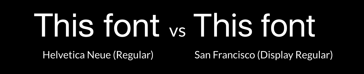
Helvetica Neue and San Francisco are easy to mistake for one another. That’s because San Francisco is so heavily inspired by Helvetica Neue. But, Apple made some key changes that make it a much better – maybe even perfect – typeface for their platforms.
Some of what I’m about to explain is sourced from this talk by Apple’s type designer Antonio Cavedoni (~30mins). Some graphics toward the end of this post are also from that talk.
Helvetica Neue, the greatest font in the world?
By now, it’s no secret to any type enthusiast that Helvetica is considered one of – if not the – greatest font in the world. In fact, there’s an entire documentary about typography, named “Helvetica.”
Helvetica Neue was rework of Helvetica, designed in 1983 to iron out some inconsistencies due to previous technological quirks.
What was wrong with Helvetica Neue?
While Helvetica Neue is a great typeface, it wasn’t enough for Apple. Why?
- It wasn’t designed with screens in mind. Screens are made up of pixels, and, as you can learn from Garamond, pixels aren’t typography’s best friend. Helvetica Neue was designed in 1983, and pixels weren’t a consideration back then.
- The design is too stale. Helvetica Neue (and the original Helvetica) are known for being a bit “stale.” They’re generally used when you don’t want the letters to get in the way of the information. This is why you’ll see it on signs in airports and subways the world over.
- It’s not Apple’s. Apple is famous for being a leader in design, so something just doesn’t sit right with them using the world’s most popular font across all of their devices. They need their own voice, and a custom typeface gives them just that.
How is Apple’s “San Francisco” font better than Helvetica Neue?
Some may think that the last reason – that Helvetica Neue isn’t Apple’s, and Apple has some kind of inferiority complex over it – is the only reason they switched. But, that’s not the case at all.
Believe it or not – at least for the application at hand – Apple has improved upon the greatest font in the world.
San Francisco is easier to read on-screen
Like I said, as you can learn from Garamond, pixels are not a friend of typographic subtlety, and even with increasing screen resolutions, type is being displayed on increasingly smaller screens.
Besides, whatever font Apple makes the default will be used by thousands of developers who will do all sorts of things with it – such as displaying it on noisy backgrounds – to make it even harder to read.
So, Apple can’t take any chances with legibility. Here are some of the ways San Francisco is easier to read on-screen.
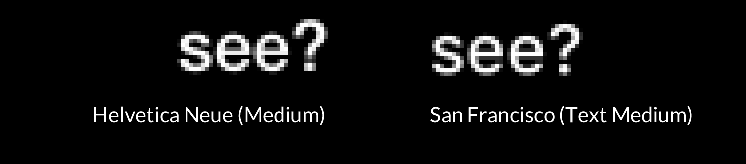
San Francisco has a higher x-height
A vast majority of the letters you read are going to be lowercase letters. This is a cruel trick inherent in typography, because, on-screen, lowercase letters are harder to read. (Remember, Garamond shows you, pixels and typography sometimes don’t mix).
San Francisco compensates for that by having a larger x-height (the height of the lowercase “x”). This allows the counters (the spaces inside of the letters) to be larger – which means more pixels to communicate the form.
San Francisco has a “display” and a “text” version
Tiny, text-sized type on a tiny screen presents different typographic challenges than larger, headline-sized type on a giant screen (such as a TV).
Small text needs to be readable, and large text needs to be beautiful. These goals are sometimes at odds with one another.
So, San Francisco comes in both a display, and a text version.
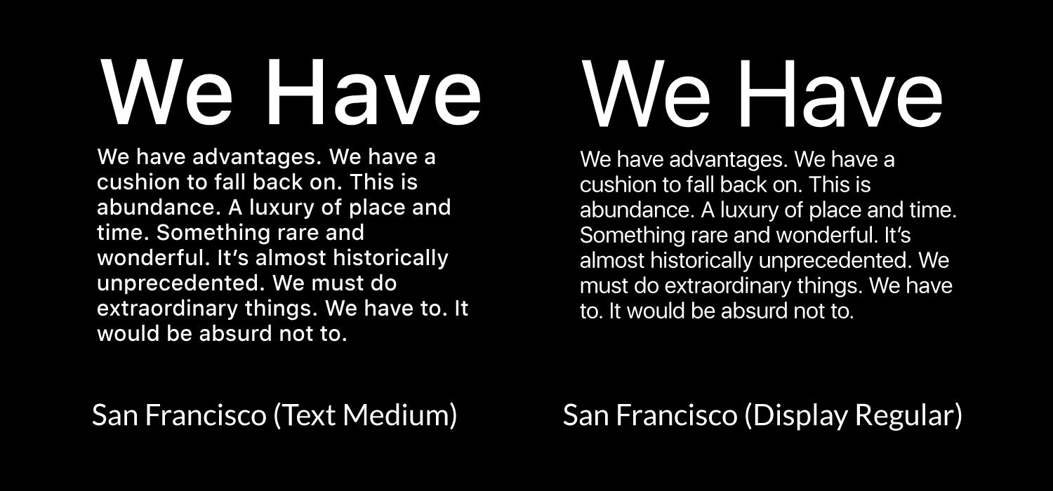
Notice how the body copy blends together in the display version. Conversely, the body copy in the text version is comfortable to read. However, the headline set with the text version is clunky (due to more spacing, and heavier strokes), while the headline set in the display version casts a more even texture, thanks to some of the adjustments illustrated below.
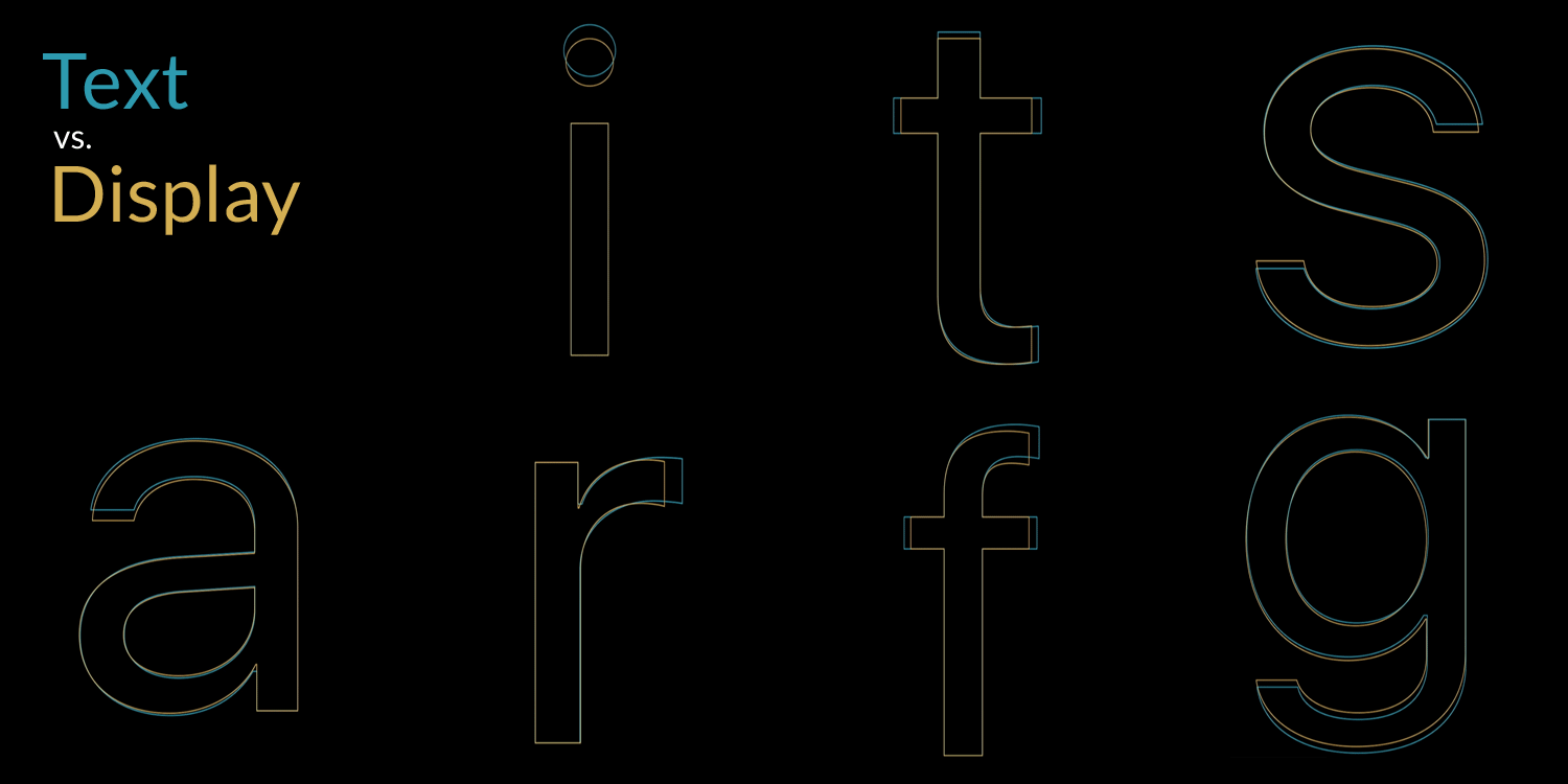
Some of the adjustments made between the text and display versions of San Francisco. Source (of Glyph outlines)
It may seem complicated to keep track of whether to use text size, or display size, but if you’re a developer, the various platforms will automatically use display size at 20 pts or higher.
San Francisco is tracked more loosely
Sans-serif type is generally considered to be easier to read at smaller sizes, because pixels and serifs don’t always agree. But, sans-serif typefaces, especially a very “rationalist” design such as Helvetica Neue, usually have one other problem. The letters are often too close together, especially at smaller sizes.
This makes it hard to read in large blocks of small text. The strokes of the letterforms kind of bleed together (as you saw in the above example).
The text version of San Francisco is tracked out more loosely (“tracking” is across many letters, whereas the more familiar “kerning” is just spacing between a pair of letters), which leaves room for more pixels to help you distinguish the letters from one another.
Additionally, tracking smarts are built into the platforms. Larger text has standard tracking, while the smaller the text, the more loosely it is tracked. (Personally, this is a trick I used to do when I did print design, so I’m excited to see it implemented in an interactive medium.)
San Francisco has a lower cap height
I just said that the higher x-height of San Francisco makes it easier to read on-screen, so what good could it do to make the cap height smaller?
Probably the biggest benefit of this change can be seen when trying to distinguish the lowercase “l” from the uppercase “I”.
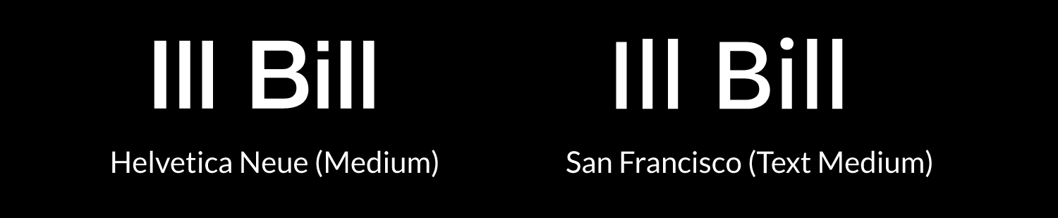
By shifting the cap height down, letters like the lowercase “l” are able to extend beyond the cap height, and are thus easier to distinguish from one another.
This has the added benefit of making the x-height seem even larger, relative to the cap height (which may encourage developers to use larger text sizes).
San Francisco looks “friendlier” than Helvetica Neue
More than one source has commented that San Francisco looks “friendlier” than Helvetica Neue, and I agree. This is part of what makes San Francisco the perfect typeface for Apple. Like Apple’s industrial design, San Francisco comfortably straddles the line between austerity and outright friendliness.
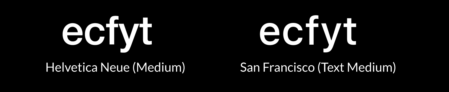
San Francisco has more open letterforms
- The “e” and “c” have wider apertures (the open spaces that prevent them from being complete circles). Besides making the font look more “friendly,” these also help it more legible on-screen.
- The terminal on the top of the “f” is slightly more open, as is the terminal on the tail of the “y.”
- The tail of the “t” is more open, and bends less abruptly.
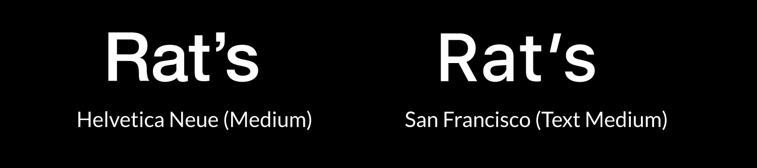
San Francisco has less-sophisticated modeling
- The leg of the “R” is a more simple stroke. Straight, instead of undulating.
- The bowl of the “a” attaches to the stem more abruptly, reminiscent of a more humanist sans-serif, such as Lucida Grande.
- The apostrophe (and quotation mark) is less contrived. It’s more like a hand-drawn apostrophe, and reads better on tiny screens.
San Francisco is more versatile than Helvetica Neue
It’s hard to argue that Helvetica Neue isn’t versatile. After all, it boasts 51 variations. But, San Francisco has a healthy set of options, optimized for display on screens.
There’s “San Francisco,” and “SF Compact” (which ships on WatchOS). Each of them have multiple weights in their display and text versions.
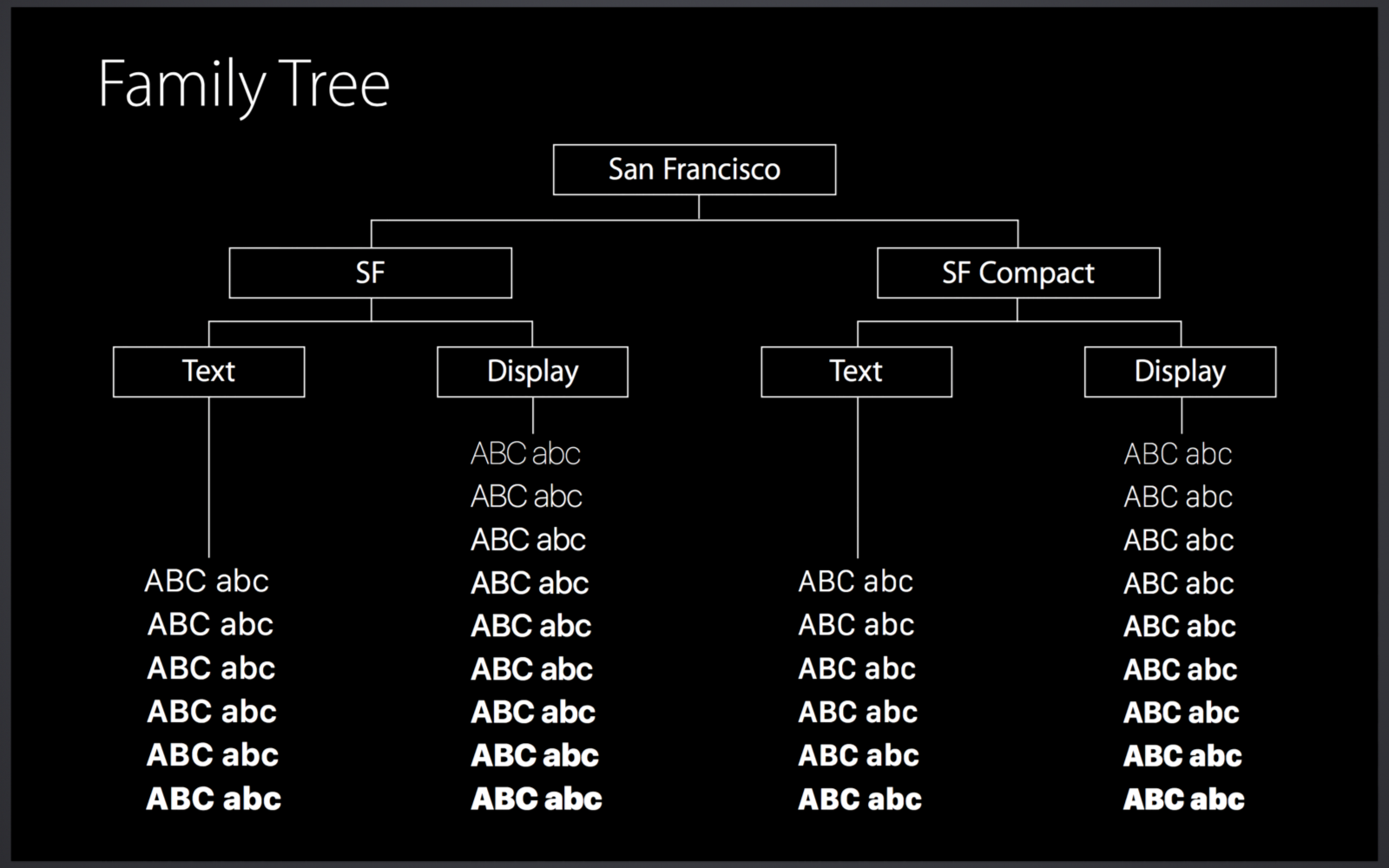
San Francisco has a wide range of variations. Source
San Francisco handles numerals better than Helvetica Neue
The implementation of San Francisco across the various platforms makes it easier for developers to choose monospaced, or proportionally-spaced numerals.
Proportionally-spaced numerals look better, because you don’t have awkward spacing in pairings that include thin numbers, such as “1.” But, they’re not ideal for situations like this one, where the proportionally-spaced numerals cause a distracting shimmy.
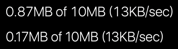
A situation where monospaced numerals (above) are more ideal than proportionally spaced numerals. Source
To be fair, you could get proportionally-spaced numerals with Helvetica Neue in iOS 7, but it used to be trickier. iOS 9 has them turned on by default. You can opt out of them with a simple API shortcut.
Since Apple devices are often displaying the time, it makes sense that, in San Francisco, the colon is now vertically-centered by default (developers can opt out in their code).
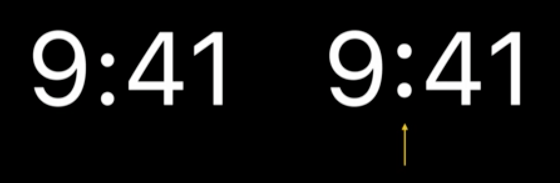
San Francisco features a vertically-spaced colon, which is ideal for displaying the time. Source
Since the numerals “6” and “9” can easily be confused for numerals such as “8” at small sizes, there are alternate versions available.
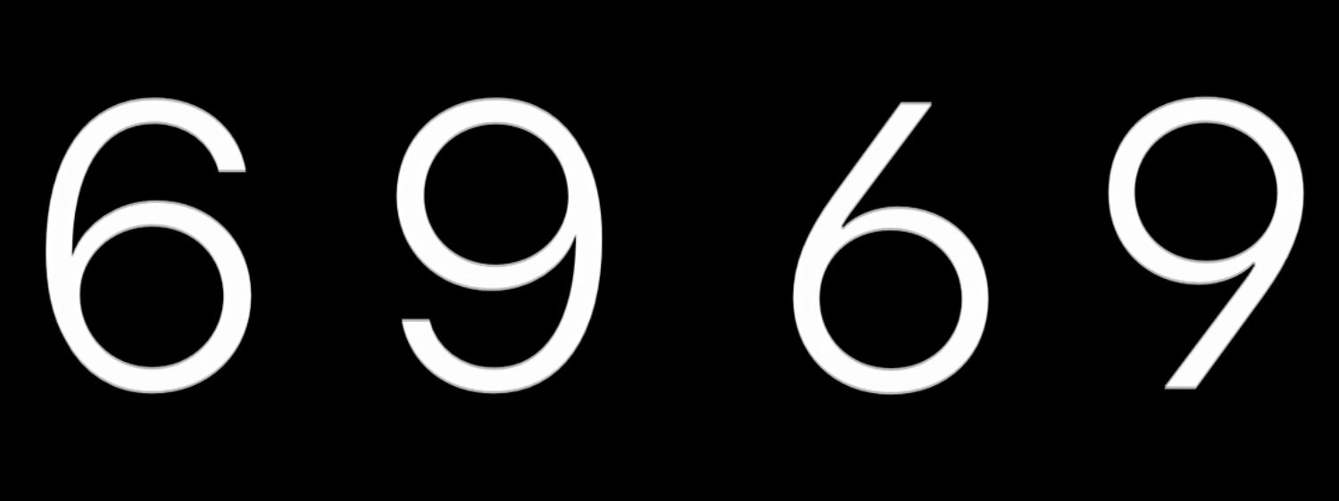
The “6” and “9” numerals are available in alternate versions that won’t be confused for an “8” at small sizes. Source
You can see one of them in action on the watch graphic below.
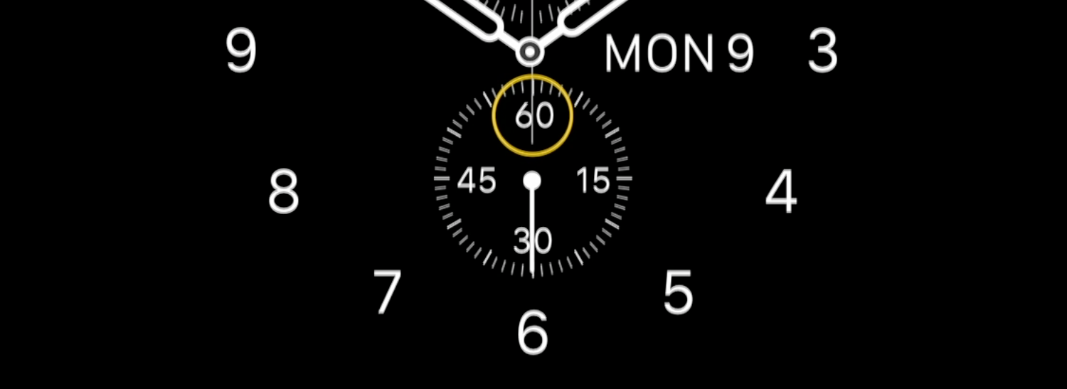
The alternate “6” in action. It won’t be confused for an “8.” Source
Is San Francisco the greatest font of our time?
Given that it’s designed specifically for Apple’s devices, and boasts all of these features that make it so well-suited for the many places it will be used, San Francisco is a huge accomplishment.
More resources on Apple’s San Francisco Font
- Download Apple’s San Francisco Font – Apple Developer Resources. Download for iOS, MacOS, and tvOS, as well as in Compact style for watchOS.
- How to Install Apple’s San Francisco Font on Mac OS X and Windows PC.
Want to learn more about picking fonts? Take my free design course.