In Defense of Papyrus: Avatar Uses the World’s Second-Most-Hated Font to Signal the Downfall of Civilization
When Ryan Gosling’s SNL skit debuted, I thought it was as hilarious as anyone else. Nevermind that – as a former type snob – it felt as if the skit was poking fun at me, personally.
In “Papyrus,” Gosling plays a graphic designer who is tormented by the fact that the Papyrus font was used for the logo for the blockbuster movie, Avatar.
But along with this skit came a flood of request for me to break down just what was so bad about the Papyrus font.
Strap in, this is a long one. If you’d rather read this on your favorite e-reader, buy In Defense of Papyrus on Kindle and many other outlets.
I reluctantly spent a year investigating Papyrus. And what I discovered shook my world.
You see, I have a bit of a past with notorious fonts. My post, “Why You Hate Comic Sans,” consistently ranks as one of the top results for Google searches for “comic sans.”
I told myself that I had retired from the world of font snobbery. I had said what I wanted to say in one book about typography. I had moved on to other things.
But like Gosling’s character in the skit, I couldn’t shake what I had seen.

It’s one thing for Papyrus to be used on the sign of a strip-mall bakery. It’s another thing entirely for it to be used to represent what would become the top-grossing movie of all time.
So, I set about the arduous task of breaking down Why You Hate Papyrus. I spent over a year writing a novel’s worth of words trying to untangle the mess. (I wish I was kidding.) I’ve edited it down to this long blog post.
There were things I learned about Papyrus that deepened my dislike of the font, but there were other things that helped me appreciate it.
The most surprising finding of all was that Papyrus could potentially be the perfect font for the film Avatar. And no, not necessarily because of any aesthetic quality the font has.
I believe that James Cameron’s use of Papyrus was an artistic choice. One that sends an important message about the potential downfall of civilization.
The surprisingly solid typographic fundamentals of Papyrus
To start off, let’s look at Papyrus’s fundamentals as a typeface. If it’s so hated, clearly it must be lacking in fundamentals. Surprisingly, I didn’t find this to be true.
If Papyrus is the second-most hated font, next to Comic Sans, it makes sense to define Papyrus’s “bad”-ness in comparison with Comic Sans. So, I set out to compare and contrast the qualities of Comic Sans and Papyrus with the qualities of the most beloved typeface – Garamond.
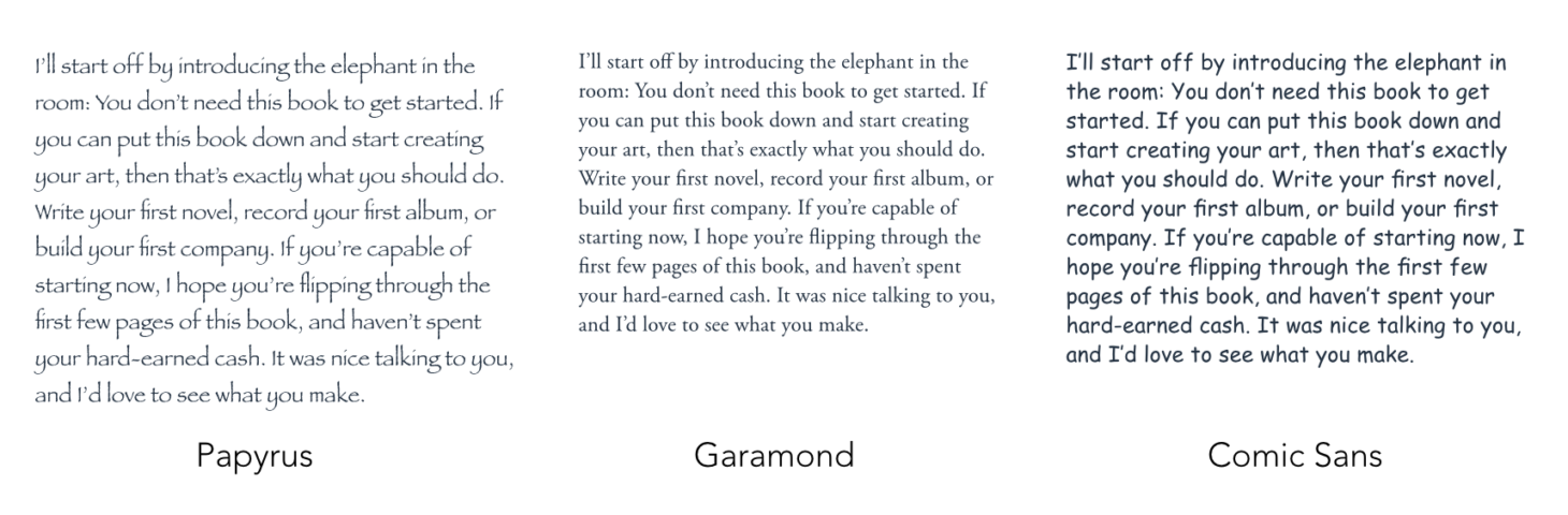
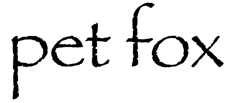
Here I’ve set blocks of body copy in Papyrus, Garamond, and Comic Sans. Keep in mind that Papyrus is what you would call a “display” font, which means it was never intended to be used in blocks of body copy in the first place – not that that has stopped anyone from using it for their term paper on ancient Mesopotamian economics.
Even though Papyrus is a display font, seeing it set in body copy still helps us analyze how well it balances visual weight.
Papyrus has an even “texture”
One of the most important fundamentals by which to analyze a typeface is that of texture. I don’t mean the “texture” in the sense of the various nicks or scratches on the edges of Papyrus letters. Instead, I mean the “texture” of an overall block of text set in Papyrus.
Letters do the job of conveying language. Each letter is inherently different from other letters. For example, an “x” is totally different from an “i.” That’s the very basis of letters.
If letters didn’t differ from one another, we wouldn’t be able to read them and get information from them. A good typeface lets those inherent differences between letters shine through, while maintaining harmony between all of the letters.
So when you set a block of text in a given typeface, that block of text should have an overall even texture. An even texture indicates that the visual weights of the individual letters are well-balanced. Thus, the inherent differences between the letters shine through, rather than those inherent differences being muddied by haphazard variations.
Trying to read a font that doesn’t present an even texture is like trying to listen to a symphony with a jackhammer sporadically pounding in the orchestra pit.
Here’s that same sample, again.
These blocks of text look very different from one another, and these differences don’t necessarily mean that one typeface has a better texture than another.
Papyrus is the lightest and roughest of them all – like the pumice rock you might find next to an active Hawaiian volcano – because Papyrus has very large counters (the spaces within letters, such as within the “o”). On the other hand, Comic Sans is very dark, since it has such wide strokes.
There are naturally going to be some darker and lighter areas in any text block. For example, the letter combination “oo” is going to create a light area in the text block, while the letter combination “ff” is going to create a dark area. Still a good typeface maintains a relatively even texture.
Before we get into whether or not the texture of Papyrus is “good,” let’s look at a variety of factors that will ultimately influence this texture.
Papyrus manages visual weight well
One of the things that makes Comic Sans a “bad” font is that it poorly manages the visual weight within each letter. This makes it impossible for Comic Sans to have an even texture when set in body copy. I was surprised to find that Papyrus didn’t have many of these problems.
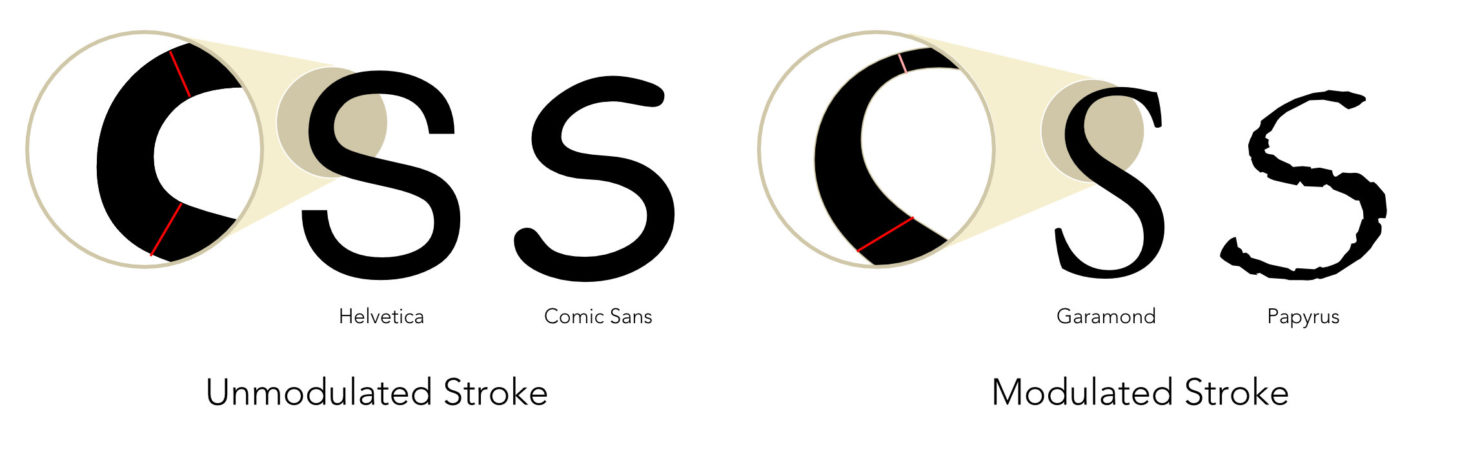
If you’ve seen my analysis of Comic Sans, you’ve seen an illustration a lot like this one. This demonstrates the idea of stroke variation. The shapes of a typeface are generally influenced by some kind of drawing tool. For example, when Garamond was first designed, Claude Garamond was aiming to mimic scribed letterforms – letters drawn with a broad-nibbed pen.
Garamond is of course very different from such letters, as it wasn’t ultimately drawn by a broad-nibbed pen – rather it was carved on the end of a steel bar, which was then punched into copper to form a mold, into which hot lead was poured.
Because of this calligraphic influence on Garamond, Garamond has stroke variation. By contrast, a modern sans-serif typeface such as Helvetica has very little stroke variation.
Comic Sans and Papyrus differ in stroke variation. Comic Sans, which mimics letters drawn by a marker, has no stroke variation. Papyrus, which mimics letters drawn by a broad-nibbed pen, does have stroke variation.
When there’s no pronounced stroke variation on a typeface, the typeface needs to be careful to manage visual weight well. Wherever two strokes of a letter join up, that’s going to create a dark spot.
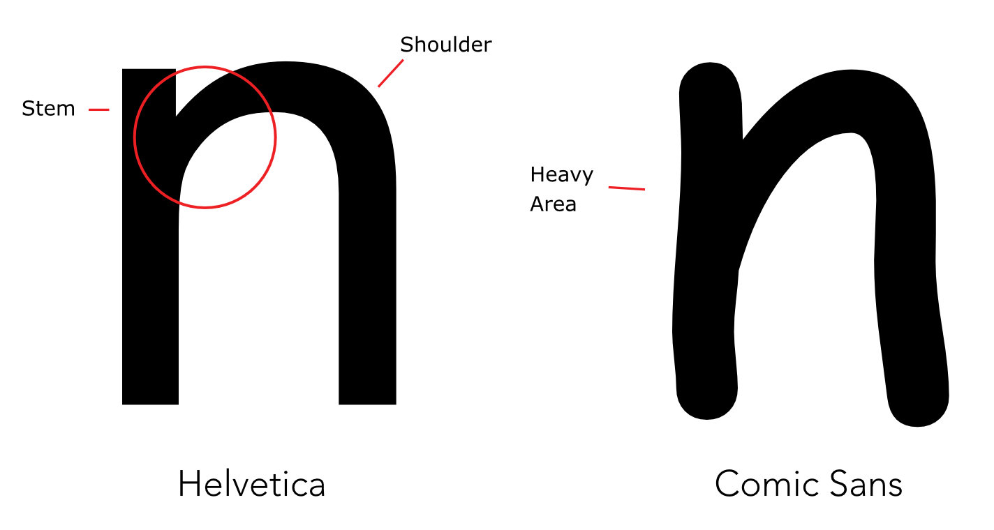
This is where good typefaces include some subtle stroke variation. Notice, for example, the “n” of Helvetica. Helvetica has almost no stroke variation, but where the shoulder meets the stem, the stroke of the shoulder is slightly thinner. By contrast, Comic Sans has no stroke variation at this point. As you can see, this creates a very heavy area. This heavy area contributes to an uneven texture in body copy.
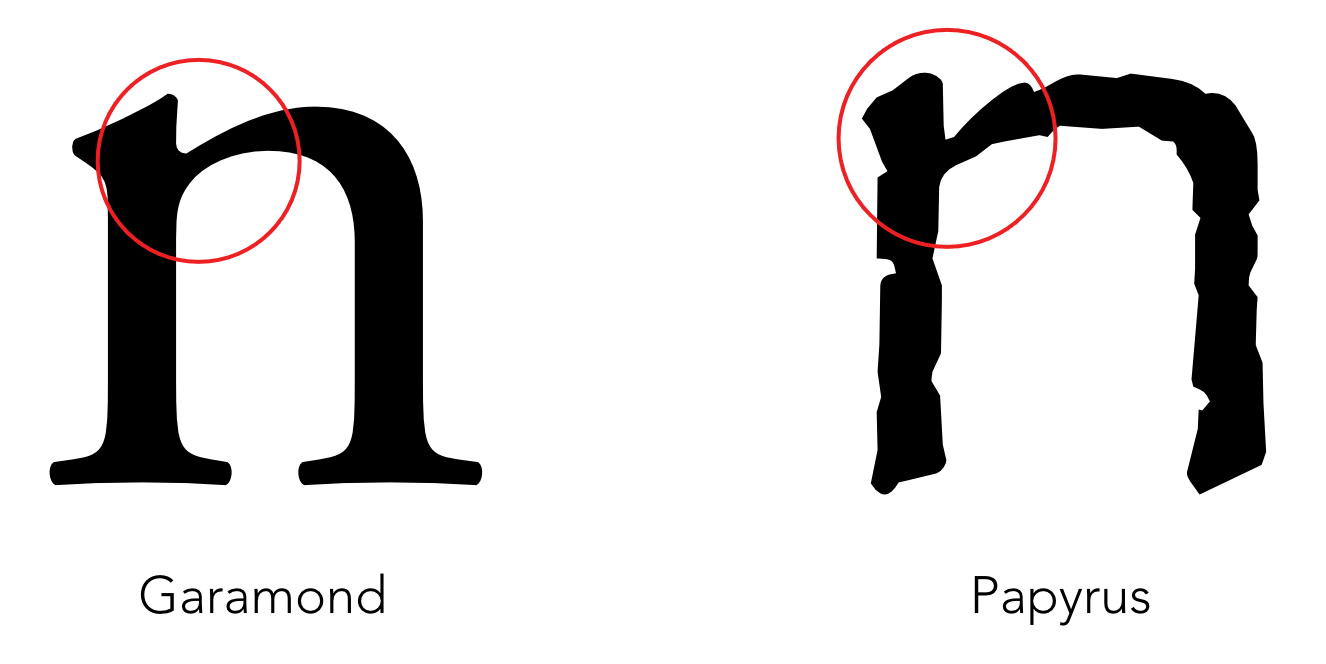
Papyrus on the other hand doesn’t have this heavy area. The shoulder of the n is thinner where it departs from the stem. This is an inherent quality of a typeface with stroke variation, and you can see Papyrus shares this quality with Garamond.
As I tried to understand Why You Hate Papyrus, Papyrus’s stroke variation caught me off guard. It helped Papyrus manage visual weight well, which helped it present an even overall texture. I had to move on to other type fundamentals.
Papyrus has consistency amongst letterforms
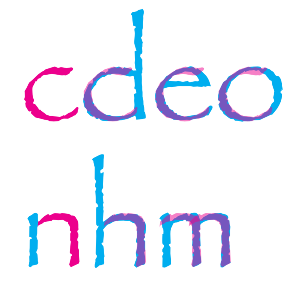
Next, I analyzed the consistency of Papyrus’s letterforms. Good typefaces are made up of a series of shapes, which are repeated from one letter to another. This helps balance the visual weight consistently from one letter to the next, thus contributing to an even texture overall.
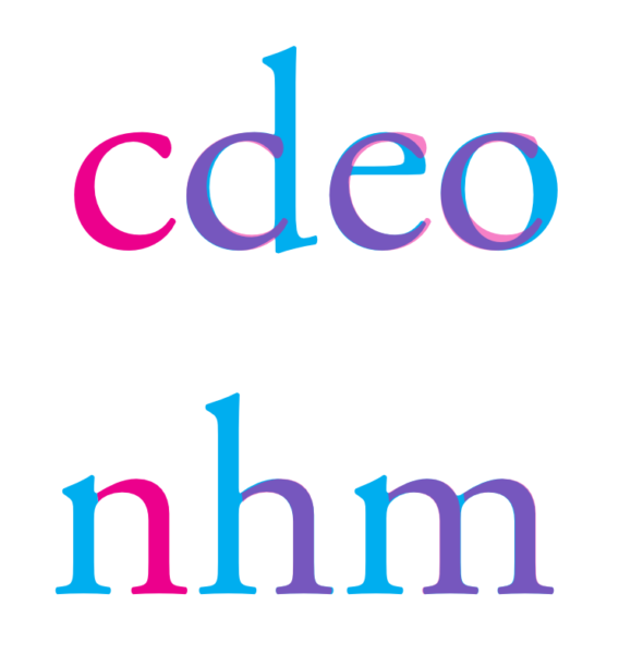
Notice how the shape of the shoulder of the lowercase “n,” in Garamond, is repeated in other letters, such as the h or the m. The lowercase “c” is repeated in the d, e, and o.
Any deviations you see of the shape are specifically created to help balance the visual weight within that letter. For example, the way the bottom of the “o” is thinner, or the way the “e” curves back around at the top.
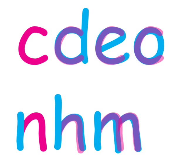
Comic Sans doesn’t have such consistency. The variations from one letter to the next are haphazard – which is, of course, the idea behind the child-like writing. Notice how the terminal of the “e” goes way beyond the shape suggested by the “c.” Notice how the “c” goes way outside the bounds that would help it harmonize with the “o.” There’s also haphazard variations in how far the “n,” “h,” and “m” extend below the baseline.
When I conducted the same analysis on Papyrus, however, I was shocked to see how consistent the forms were from one letter to the next. It’s handled – dare I say – beautifully. You can see the careful hand of the imaginary scribe writing these letters. The angle of the nib is consistent, and the shapes followed to draw the letters are consistent.
The one deviation is that the shape used in the shoulder of the “n” is much more narrow in the m. With Papyrus’s wide proportions, the m would look out of place otherwise. This compensation counterintuitively makes Papyrus more consistent.
So far, I couldn’t find any faults in Papyrus’s typographic fundamentals. The weight was well-managed within the letters, and the letters were consistent with one another. Papyrus shared these qualities with Garamond, while Comic Sans was severely lacking in both of these qualities.
Papyrus has good kerning tables and letterfit
Kerning and letterfit help a typeface balance the weight between various letter combinations. Electronic fonts have data within them called kerning tables. (By the way, font snobs love to point out that a “font” displays a “typeface,” and that the two terms shouldn’t be used interchangeably, though good luck getting a clear explanation on why it matters.)
The kerning tables determine how close to one another various letter combinations are. The type designer literally goes through every conceivable letter combination and determines how close either letter in each pairing should be to one another.
But it’s impossible to kern well if a typeface doesn’t have good letterfit in the first place. If certain letters are designed such that they can’t possibly balance the space between themselves and other letters, then they have poor letterfit.
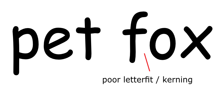
Here you can see the poor kerning and letterfit between the f and the o of Comic Sans. There’s a large area of white space between the two, below the crossbar of the f. That’s the fault of a poor kerning table.
But even if you manually kerned the f and the o, or put them closer to one another, you’d have another problem. Comic Sans also has poor letterfit.
If you tried to close the white space between the f and the o, the crossbar of the f would get very close to the o. This creates a point of tension. It becomes a distracting point that interrupts the flow of reading, and makes the overall texture uneven.
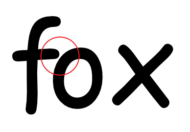
I could have sworn that Papyrus had kerning or letterfit problems. But when I looked closely – at least at the version that shipped with my Mac (several different versions exist, which likely vary on finer points, such as kerning tables) – I couldn’t find any actual evidence of such problems. Quite the contrary.
Notice, for example, how well the end of the crossbar on the “f” accommodates the curve of the “o.” I tried other letter combinations, and again found Papyrus’s kerning to be flawless. I then scanned my entire body copy sample of Papyrus, looking for points of tension or gaps or other quirks. I found nothing unusual, aside from the fact that Papyrus needs to be set with a lot of space between lines – or “leading” – because the ascenders and descenders – the top of a “d” and the bottom of a “g,” for example – are freakishly high and low. (This alone doesn’t make it a bad typeface. It only makes it unusual.)
Papyrus presents an even texture in body copy
Below, I’ve blurred the body copy samples of Papyrus, Garamond, and Comic Sans. This simulates what these might look like as you squint your eyes to try to analyze the textures created by each of these three typefaces.
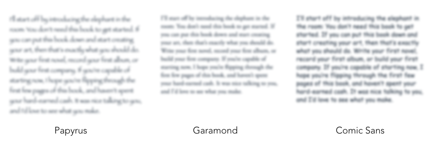
Notice that there are many very dark areas within the block of Comic Sans, contrasted with some relatively light areas. This level of inconsistency is a large part of what makes Comic Sans a bad font. You don’t see so much inconsistency in the block of Garamond. Surprisingly, thanks to well-managed visual weight within the letterforms, consistency amongst letterforms, and solid kerning and letterfit, you don’t see so much inconsistency in the block of Papyrus.
After examining Papyrus’s solid type fundamentals, I began to wonder Why You (still) Hate Papyrus. As a former type snob, I have to admit that some of the appeal of such snobbery is a need to feel superior. I don’t get that pleasure out of type analysis anymore.
Something was still off. Something deeper than the fundamentals. Or, to be more accurate, something more on the surface than the fundamentals.
Okay, so Papyrus has solid fundamentals. But Papyrus is “materially dishonest”
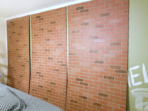
One day, I found myself in a shopping mall, searching for jeans. Maybe it was from all of the pacing back in forth in my apartment, thinking about Papyrus. Whatever the cause, I had worn a hole in my jeans – and not in a place that looks cool.
Little did I know, I’d find something in that shopping mall that would help explain Why You Hate Papyrus. As I waited in line at the register, I saw this “column.”
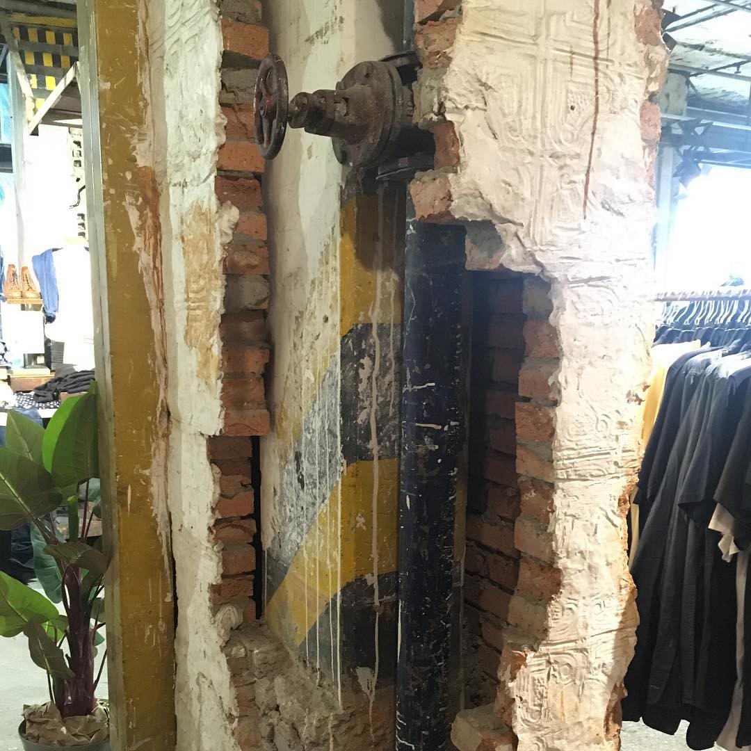
I used to work at an architecture firm. That’s where I learned about the concept of “material honesty.”
The principle of material honesty states that a material used to build something should be what it looks like it is. If it looks like wood, it should be wood. If it looks like stone, it should actually be stone. If it looks like brick, it should actually be brick. It’s an extension of the term “form follows function.”
This column gives the appearance of having been partially destroyed. The plaster tiles that supposedly once lined the outsides of this column are still there.
Except this column wasn’t partially destroyed. It was made to look this way by the retailer when they took over the space. This is in a modern shopping mall in South America. It’s not some rehabbed warehouse in SoHo.
When I saw this column in the store, it reminded me Why You Hate Papyrus, even if it does have solid typographic fundamentals. Papyrus violates the principle of material dishonesty.
Papyrus’s material dishonesty makes it a dead giveaway
Even though, as the character played by SNL cast member Chris Redd points out, “they clearly modified” Papyrus in creating the Avatar logo, it’s still a dead giveaway, because of Papyrus’s material dishonesty.
Just look at the stem of the “R” on the Avatar logo, as compared to a standard Papyrus “R.” The most obvious similarities are the two giant chunks taken out of the stem.
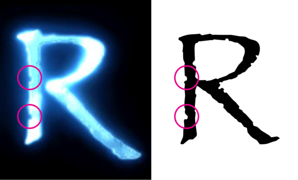
These chunks are there to suggest that these aren’t your average, everyday letters. These chunks suggest that the letters were in fact hand-calligraphed on papyrus, the ancient paper made from smashing together thin strips cut from the pith of the papyrus plant.
As the nib of the theoretical pen traveled over the theoretical paper, it encountered peaks and valleys. Those peaks and valleys caused the nib to occasionally break contact with the paper, thus creating these rough edges. That’s what you’re supposed to believe anyway.
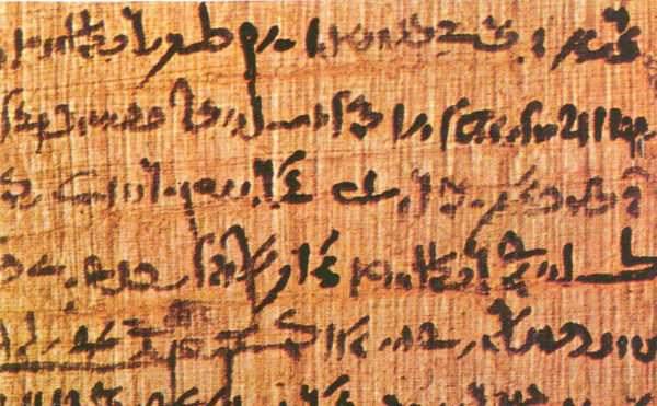
In reality, Papyrus isn’t hand-calligraphed on papyrus. It’s simply a list of instructions that tell a computer how to draw it: turn forty degrees to the left here, curve this much over there, now turn twenty degrees to the right, etc. The computer then uses these instructions to draw Papyrus on a computer screen, to print it on paper, or to project it on a movie screen.
Papyrus isn’t hand-calligraphed on paper. It’s merely the suggestion of letters hand-calligraphed on paper. Papyrus is the fake-destroyed-column of fonts.
Material dishonesty is all too common today
If you didn’t know about the principle of material honesty before, I apologize in advance for what you’re about to experience. When I shared the above picture on Instagram, with a short introduction to the concept of material honesty, a commenter said they weren’t able to sleep.
As Gosling’s character can attest to, learning about design has a way of making you lose sleep. That’s because when you learn the difference between good and bad design you notice bad design everywhere.

And material dishonesty really is everywhere. It’s on the fake wood grain of your car’s dashboard. It’s on the wood grain of your IKEA furniture. It’s on the “bricks” of many suburban McMansions – cinder-block walls with brick-like tiles adhered to them.
Shortly after seeing this column, I noticed material dishonesty in my bathroom tiles. They’re supposed to look like marble – something they don’t do convincingly. And if you look really closely, you can even see the dot pattern of the printer that printed the “marble” pattern onto them.
You might be wondering why it matters whether a font or a bathroom tile is materially dishonest. I’ll get to that, but first, let’s look at why it turns out that Papyrus might be the perfect font for the movie Avatar.
Papyrus is the perfect font for the movie Avatar (& it’s not what you think)
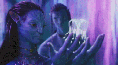
In my quest to understand Why You Hate Papyrus, I figured I should see Avatar before I could comment on the use of Papyrus in the movie.
Friends I told were shocked that I had never seen the Avatar. In fact, before Gosling’s SNL skit, I didn’t know that Papyrus had been used in this blockbuster. A quick search on Google showed me that this was a hot topic on the “blogosphere” when the movie debuted in 2009. I guess the same bookishness that makes you a font snob makes you miss it when the purveyors of pop culture commit type crimes.
The opening of the movie showed me the Avatar logo that was the subject of the SNL skit. Chris Redd was right, there were a number of modifications made to the font for the sake of the logo.
With these modifications, it didn’t bother me so much that Papyrus was used for the Avatar logo. These modifications washed away its most egregious signs of material dishonesty.
I realize that for comedic effect Gosling’s character had to claim that the designer “randomly selected Papyrus” directly from the drop-down menu. But it’s not true.

But then I almost choked on my Topo Chico when I noticed that Papyrus was used for the subtitles of the movie.
Avatar’s Papyrus subtitles bring Papyrus’s worst qualities to the surface (& it’s perfect)
The problem with Papyrus being used in the subtitles of this film is that it brings the material dishonesty of Papyrus to the surface.
Each iteration of each letter of Papyrus has the same fake nicks and scratches as the previous one. See?
Again, an SNL skit wouldn’t have the same bite to it if Gosling’s character had been so distraught over the use of Papyrus in the subtitles of a movie.
Just imagine it:
RYAN GOSLING (V.O.)
I forgot about it for years, but then I remembered that Avatar, the giant international blockbuster, used the Papyrus font in its SUBTITLES.
Huh?! No. “Logo” is objectively a funnier word than “subtitles.”
Still, Papyrus’s use in the subtitles appears to be a type crime of the highest order. Especially with the resources James Cameron had at his disposal.
The technology existed to make Papyrus materially honest in Avatar
Many type snobs have pointed out the irony that a system font that comes standard on almost every computer in the world is used in a movie with a $280 million budget.
But even more ironic is the fact that James Cameron delayed the production of Avatar by ten years, all because the technology didn’t yet exist to carry out his vision.
And even as Cameron was inventing new cameras and rendering technology to make Avatar a reality, the technology already existed to address the material dishonesty of Papyrus.
A materially-honest Papyrus is possible with OpenType contextual alternates
OpenType started being developed at Microsoft in 1994. Adobe then began contributing to the project in 1996. OpenType is a technology that allows a single font file to cover a bunch of different variations of the same letters.
For example, with a simple drop-down menu in an application, you can choose real small caps (no, proper small caps aren’t simply smaller versions of the capital letters of a typeface).
In 2001, OpenType started supporting a feature called “contextual alternates.” This made it so that you could have several different versions of the same letter in a single font.
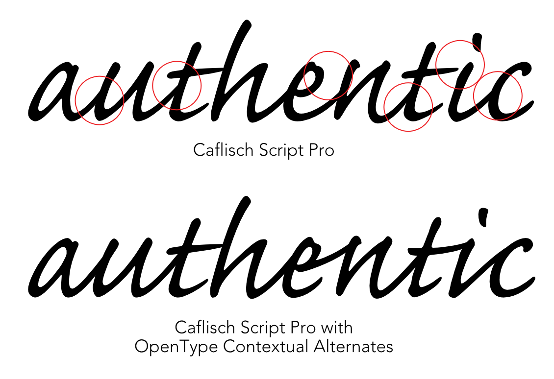
The first font to use contextual alternates was Caflisch Script Pro. To be a convincing “script”-style font, Caflisch needed to have different variations of the same letters. Sometimes one letter needs to connect to the next letter up high, near the x-height. Other times, it needs to do so down low, near the baseline.
James Cameron delayed the production of Avatar by a decade, to improve the technology. But he didn’t bother improving Papyrus.
James Cameron originally conceived of Avatar the same year that OpenType was developed, in 1994. He first announced his intention to make the film in 1996, slated for a 1999 release. But he halted production because he didn’t feel existing technology could make his vision a reality.
By the time Avatar was released in 2009, the technology to develop a materially-honest version of Papyrus had been around for eight years. OpenType’s contextual alternates made it possible to have several variations of each letter in the font. The nicks and scratches in one lowercase “l” would be different from the nicks and scratches in the next one.
A Papyrus with contextual alternates would still not have the areas of subtle transparency that you would see in letters actually scribed on Papyrus, but even if there were only a few versions of each letter, that would be a big step forward. A step toward material honesty.
If Cameron could work with linguists to invent an entirely new, real and learnable language for the Na’vi, I’m sure he could have found a way to make some modifications to a font.
That is, unless there was a good reason not to improve the font.
The material dishonesty of Papyrus is a deftly-crafted allegory for Avatar’s message
As I watched Avatar for the first time, and I got pulled into the story, I started to believe that Papyrus may have been the perfect choice for the movie – and not because of the aesthetics that SNL cast member Heidi Gardner described as “tribal, yet futuristic.”
Avatar is about a military operation on the planet Pandora. Pandora is a planet full of stunning biodiversity – plants and animals that Cameron and team spent years developing.
The Na’vi are human-like creatures who live in perfect harmony with nature. The Na’vi use the neural network that connects all living creatures on the planet Pandora to connect to flying animals, for example.
Humans from Earth have been sent to Pandora to mine unobtanium, an extremely valuable material, (not to be confused with the differently-spelled-but conceptually-identical “unobtainium.”)
But the humans have a problem. The main stash of unobtanium on Pandora lies beneath a gigantic tree in the midst of the Na’vi’s territory, called the Tree of Souls.
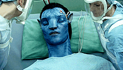
The humans can’t simply go in and get the unobtanium. They have to learn about the Na’vi culture. And to infiltrate that culture, they become fake Na’vi by inhabiting genetically-engineered Na’vi bodies that the humans then control with their brains.
Unfortunately, the humans succeed. It’s disastrous for the Tree of Souls, the Na’vi, and the planet of Pandora.

Papyrus is a warning call: Material dishonesty is everywhere, & we must stop it
Are you starting to see a connection here? Papyrus is a false representation of an organic form. You could call it an “avatar.” An “avatar,” in the movie Avatar is a false representation of a Na’vi.
The movie Avatar explores the theme of a conflict between harmony with the environment and greed. James Cameron said that “the Na’vi represent something that is our higher selves, or our aspirational selves, what we would like to think we are.” While there are some good humans in the film the humans “represent what we know to be the parts of ourselves that are trashing our world and maybe condemning ourselves to a grim future.”
Material dishonesty is a symptom of cultural illness. Material honesty is the pursuit of one thing, at the expense of everything else.
This is why material dishonesty matters, and this is Why You Hate Papyrus. In the movie Avatar, the Na’vi are fooled by the false representations of themselves, and it leads to tragedy.
You don’t only see material dishonesty in your furniture, and your bathroom tile. Material dishonesty seeps into every nook and cranny of civilization.
One moment we accept walls that look like brick, but aren’t, and the following moment we accept something that looks like food, but isn’t nourishing. We accept someone who looks and acts like a doctor, but doesn’t improve people’s health. If we’ll accept these things, we’ll accept politicians who have one superficial characteristic that fits what we imagine a politician to be – and everything else be damned.
Where do you draw the line on material honesty?
It’s hard to know exactly where to draw the line on material honesty. I know some of you are thinking, doesn’t it make things more efficient?
So you didn’t deface another mountain quarrying marble for the retaining wall next to your driveway – so what? If your shirt has flowers printed on it, is that material dishonesty? Garamond was originally trying to mimic scribed letters – was that materially dishonest? Even Louis Sullivan himself, the architect who coined the term “form follows function,” was famous for the iron and terracotta organic forms that clad his buildings. Was that materially dishonest?

In robotics, there is a concept called the “uncanny valley.” This is the phenomenon that we are okay with humanoid figures that either look perfectly lifelike – a feat yet to be accomplished – or that take on their own characteristics, like a cartoon character; or a Na’vi, for that matter.
Anything in that valley between caricature and reality creeps us the fuck out. Anything between those two peaks is in the uncanny valley.

There are a number of theories about why humanoid figures in the uncanny valley make us uncomfortable. Some think they remind us of our mortality. Others believe they trigger the same reaction that would make us avoid someone sick with a contagious disease.
But I think there’s a more important reason: It’s that we’re evolutionarily wired to be averse to deception. Not only are we averse to deception, but it also worries us when others aren’t attuned to deception.
Yes, it was dangerous for our ancestors if they couldn’t spot the striped tiger in the bush, but it was also dangerous for those ancestors if their tribemates didn’t notice the tiger either. We have to look out for each other, otherwise, we could be infiltrated by a fraud, much like the Na’vi were.
I think there’s an uncanny valley to material honesty, too. If something is a convincing representation of another thing, it doesn’t bother us so much. Or, it can take on a life of its own, the same way punch-cut typefaces such as Garamond did when they first originated.
But if it’s in the uncanny valley – if it, like Papyrus, tries to convince us, with all of the subtlety of a polar bear painted like a penguin, that it’s authentic – the observant amongst us get worried. We say to ourselves, “aren’t you seeing what I’m seeing?”
What does the Avatar design team think?
I tried to track down the designer of the Avatar logo, but I was unsuccessful. When I emailed Zachary Fannin, a graphic designer who worked on the film, he said he didn’t know who designed the logo, adding “believe me, I’ve asked around,” and that “It wasn’t me. Although I’d happily own it if I did.”
Zachary didn’t seem that bothered by the logo, but he, too, took issue with the subtitles. “My strongest memory is when [Papyrus] showed up as the subtitle text in the movie. I might have let out an ‘ooof.’ My snarky graphic designer take at the time was definitely in line with the general consensus.”
The real reason Papyrus was chosen for the logo and subtitles in Avatar remains a mystery. Not even Zachary knows.
But I like to think that the use of Papyrus in the movie Avatar was an intentional and brilliantly subtle message. As the movie is warning us not to lose touch with authenticity, it’s doing so by displaying a materially-dishonest typeface in the logo and the subtitles.
It’s telling us: Wake up. Don’t lose your soul in pursuit of a reductionist representation of success.
Finally, I called Papyrus’s designer, & you won’t believe what he designs now
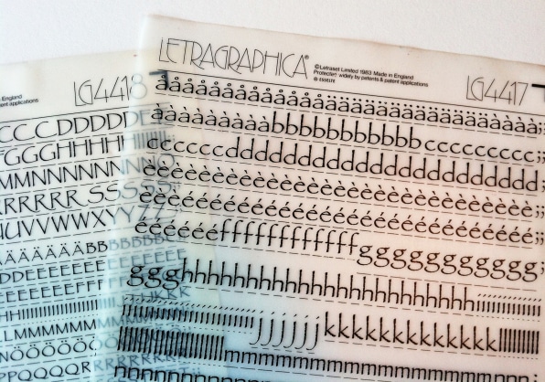
Chris Costello was only twenty-three years old when he scribed onto paper the letters that would one day become the world’s second-most hated font. “It was pen and ink,” he told me over the phone. “[I was] dipping the pen [in an] inkwell. Writing it on a very rough textured paper. That’s what gave it the nicks and scratches and stuff. It looked archaic…. Just having some fun, really. But it just kinda began to grow, and I thought, ‘hmm. This might be able to go somewhere.’”

After ten rejection letters, Costello was excited when Letraset wanted to buy the rights to the design. He eagerly worked with the company’s Colin Brignall to adapt those letters to work better with the limitations of their vinyl, rub-on lettering. “Letraset came back and said ‘well, why don’t you thicken everything up a bit,’ because my original idea was very feathery, very thin.”
In the process, Costello also added lowercase letters – he originally intended the typeface to be all-caps. He also had to translate his original calligraphed letters to four-inch-high hand-drawn characters, choosing which nicks and scratches to include that wouldn’t cause the letters to distort during the rub-on process.
Years after Letraset bought the rights to Papyrus, the design was licensed to be used in electronic fonts, and the rest is history. Letters that were originally calligraphed on paper – that originally varied from one to the next – got translated into individual four-inch-high letters, then vinyl rub-ons, and eventually vector files on nearly every personal computer in the world.
Costello, still a practicing freelance designer, has a great sense of humor about Papyrus’s reputation. He told me of the SNL skit, “I couldn’t stop laughing when I saw the thing.”
As I began to tell him about my theory that Papyrus was the perfect font for Avatar, he excitedly interjected, “Exactly!,” but I sensed that his approval was for aesthetic reasons. He’s defended the use of Papyrus in other articles, saying “I believe it’s a well-designed font, it’s well-thought out.”
Costello has no problem with the aesthetics or material honesty of Papyrus. He blames its bad reputation on overuse. He thinks it’s been “so overused that a lot of the artistic intention was just washed away, and washed out by overuse.”
Which is a nice theory, but I have yet to write an article called “Why You Hate Garamond” – and I doubt I ever will.
Then I told him my theory about the material dishonesty of the design, and its relationship with the theme of the movie. “Oh yeah, that’s an interesting relationship there,” he said, “like the font is an avatar.”
They urged Papyrus’s designer not to use Papyrus
Then Costello told me something about one of his design gigs. When he was training to work with this client, they had already had a run-in with Papyrus. Perhaps because it didn’t go so well, they recommended against using Papyrus on any designs. It didn’t have anything to do with design taste – it was all about material honesty.
The designs Costello was making were to eventually be milled into metal molds. The drill bit that mills the molds spins, taking away layer after fine layer of metal, making a three-dimensional relief. Under a magnifying glass, it might look like a cardboard landscape model you might see in a museum.
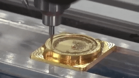
But the drill bit is limited in how small of spaces it can get into. The drill bit is too big to carve the nicks and scratches that are in Papyrus’s design. The materials used in the production process can’t replicate the forms in Papyrus – scribed letters, turned to outlines, now being carved into a three-dimensional die.
For this reason, completely independent of the fact that this organization would one day commission Costello, they strongly discouraged their designers from using Papyrus. Costello paraphrased their advice as “use with caution, only for technical reasons.”
“Technical reasons.” It’s not “material honesty,” but I’ll take it. Sometimes, material dishonesty goes so far that it’s physically impossible to replicate a design. But with all of the fake brick walls and printed wood-grain out there, I wonder how low of a bar is set for that standard. Ultimately, using Papyrus to create these dies would be materially dishonest. So materially dishonest that this client didn’t want to deal with it again.
Whether it’s for aesthetic reasons or technical reasons, its for the best if this client steers clear of Papyrus. This isn’t a place where we need more material dishonesty.
The client who advised the designer of the most famous materially-dishonest font not to use his own designs: The United States Mint. Chris Costello now designs coins for the United States Mint.
The Mint’s run-in with Papyrus came when they used it on some Congressional Gold Medals in 2008, such as this one, created to honor Native American code talkers. “Code talkers” assisted the U.S. Armed Forces during World War I and World War II, by using their tribal languages for secret communication. Kind of like if the Na’vi had inhabited human avatars to help in a fight with some other planet.
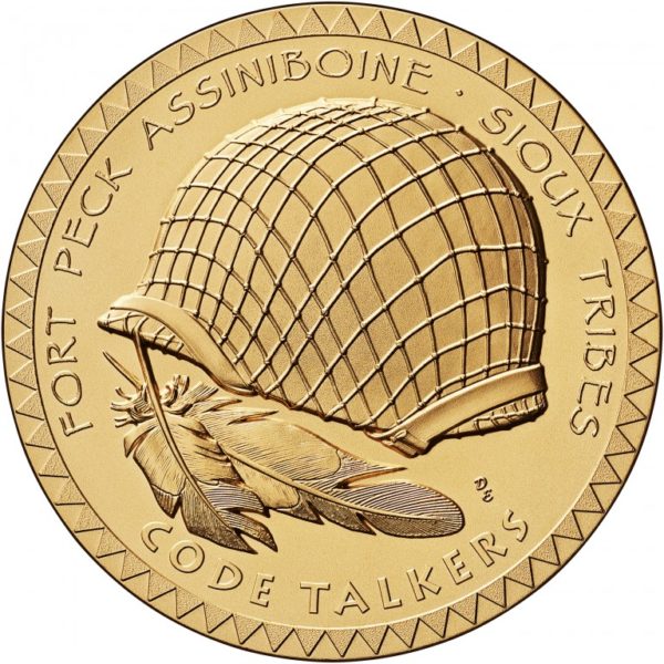
When Costello directed me to look at this medal on the U.S. Mint’s website, I hardly recognized Papyrus in the design. All of the nicks and scratches were lost.
Costello speculated that it might be for this very reason that the Mint now discourages its designers from using Papyrus, amongst other very detailed fonts. Even on a coin three inches in diameter, the technology can’t capture the detail.
So the Mint discourages coin and medal designers from using Papyrus not because Papyrus itself is a materially dishonest font, but because using Papyrus on a coin design is so materially dishonest that it borders on impossible.
You can rest easy. If it didn’t work on a three-inch Congressional Medal, you won’t be seeing Papyrus on the coins in your pocket anytime soon. But, Costello told me that the technology for manufacturing coins keeps getting better. So, who knows what tomorrow will bring?
I know I’m afraid. Are you?