September 18, 2014
 Something about that “outline” function is so enticing to amateur designers. Sometimes type is on a busy background, the colors don’t contrast enough, or they just think it looks cool to outline type.
But this can be a big mistake! Poorly-considered outlines are a dead giveaway of design n00bism.
The main problem is, many software programs apply outlines in a way that makes the outlines intrude on the letterforms. They get distorted, and lose all of their character – no pun intended.
Find out how to avoid Outline-itis in this video:
September 04, 2014
Small caps can be a useful tool for that extra bit of typographic expression, but if you don’t use them right, your plan will backfire. You’ll make your typography look sloppy, and unprofessional.
“Fake” small caps can be seen everywhere these days. Many desktop publishing programs have “small caps” buttons that simply scale the capital letters down to make small caps.
But isn’t that what small caps are? NO! I explain in this video, or just keep reading:
“Fake” small caps vs. “Real” small caps
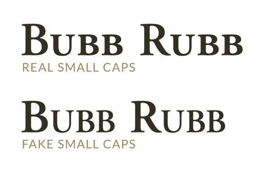
“Real” small caps are drawn separately from the standard capital letters in a font. The strokes of the letters are made fatter, to account for the fact that they will look too thin if the letters are just scaled down.
Notice the difference between “real” and “fake” small caps in the image below.

If you don’t learn the difference, you’ll likely be using fake small caps for the rest of your life, and design pros will gather in dark chambers to privately poke fun at your work.
How to avoid using “fake” small caps
One way to avoid using fake small caps is to just not use small caps! You could always just use all-caps instead. Nobody will ever say “hey, did you notice that weirdo never uses small caps?” You’d be fine, and you could express yourself typographically numerous other ways.
There are two different ways that real small caps can be used: you can use a special small caps version of your font, or you can access custom small caps through OpenType.
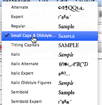
If there’s a dedicated small caps version of your font, can see this in your font picker. Here’s Adobe Garamond in InDesign.

Sometimes you can choose a small caps font from a font picker.
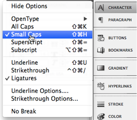
However, this isn’t a foolproof way to ensure you have real small caps available. Some OpenType fonts have small caps alternates built-in. When you select “small caps” from the Character Palette in InDesign, for example, you’ll get real small caps if you’re using one of these kinds of OpenType fonts. If there isn’t a dedicated alternate small caps version, you’ll get fake small caps!

Some OpenType fonts have small caps built-in.
It’s very confusing, and kind of scary. It seems there’s no way to guarantee you’re using real small caps.
The best method is to just learn to spot the difference between real and fake small caps. It may seem tricky at first, but once you figure it out, you’ll never miss it.
Don’t be fooled! Using “real” small caps in CSS
If you use CSS’s font-variant: small-caps property you might think you’re getting real small caps – especially if there is a “real” version of small caps available for the font you’re using. Don’t be fooled! With the state of browsers today, font-variant: small-caps still gets you fake small caps.
The trick is to make a small caps version available using CSS’s @font-face rule. Then, you can use it like you would any font.
@font-face {

font-family: “Adobe Garamond SC”;

src: local(“Adobe Garamond SC”);

}
Here it is being used as an abbreviation.
p abbr {

font-family: “Adobe Garamond SC”;

text-transform: lowercase;

}
If you’re using an OpenType font, and know there’s a small caps variation of your font available, you can try using CSS’s “font-feature-settings” property, which has pretty decent browser support, to summon those small caps.
Choose your small caps poison
Now you know the difference between real and fake small caps, so do with that knowledge what you see fit. Stop using small caps altogether, learn to spot difference (and act accordingly), or just go on using fake small caps (while leading a life of eternal typographic alienation and suffering).
August 14, 2014
It’s 3 in the morning, and you’re putting the final touches on your layout. It looks clean, with everything in its place – lined up on the grid. You squint from afar. “The edges of these type blocks look uneven,” you say to yourself. You hop into Sublime, and type text-align: justify. keep on reading »
May 14, 2013
I wrote Design for Hackers to teach hackers about design. But that wasn’t the hokey pokey of it.
That wasn’t what it was “all about.” keep on reading »
September 01, 2011
One of the most often overlooked factors of design – by beginning and even professional designers – is that of the delicate use of white space. By really considering the way that white space works, you can communicate more elegantly, and create design that has a more “clean” look. By really considering the way white space works, you’ll be less likely to use extraneous ornamentation such as rule lines, and you’ll be less likely to change fonts and colors just to differentiate pieces of information in your design.
keep on reading »
January 25, 2011
Everyone loves to hate Comic Sans. The child-like handwriting font is so infamous, there is a movement to try to ban it. Mention its name to the common layman (aside from a preschool teacher), and you will likely get a chuckle, mention it to a trained designer, and you’ll get a look of disgust. In my free design course, I teach you how to battle font anxiety, but I can tell you right now Comic Sans is usually not a good choice. What exactly makes Comic Sans so horrible?
keep on reading »
September 28, 2010
Monet’s paintings evoke a sense of energy and life, they leap off the canvas with color and contrast, but Monet somehow managed to avoid using the color black for nearly his entire painting career. By avoiding black in your own designs, you can replicate some of this dynamism. keep on reading »
August 12, 2010
Amongst designers – especially print designers – Garamond is considered one of the best fonts in existence. It’s timeless, and very readable. But, because of the limitations of current display technologies, it’s not a good font to use in web copy – even with the advent of font embedding methodologies such as TypeKit and Google Font API. keep on reading »
 Something about that “outline” function is so enticing to amateur designers. Sometimes type is on a busy background, the colors don’t contrast enough, or they just think it looks cool to outline type.