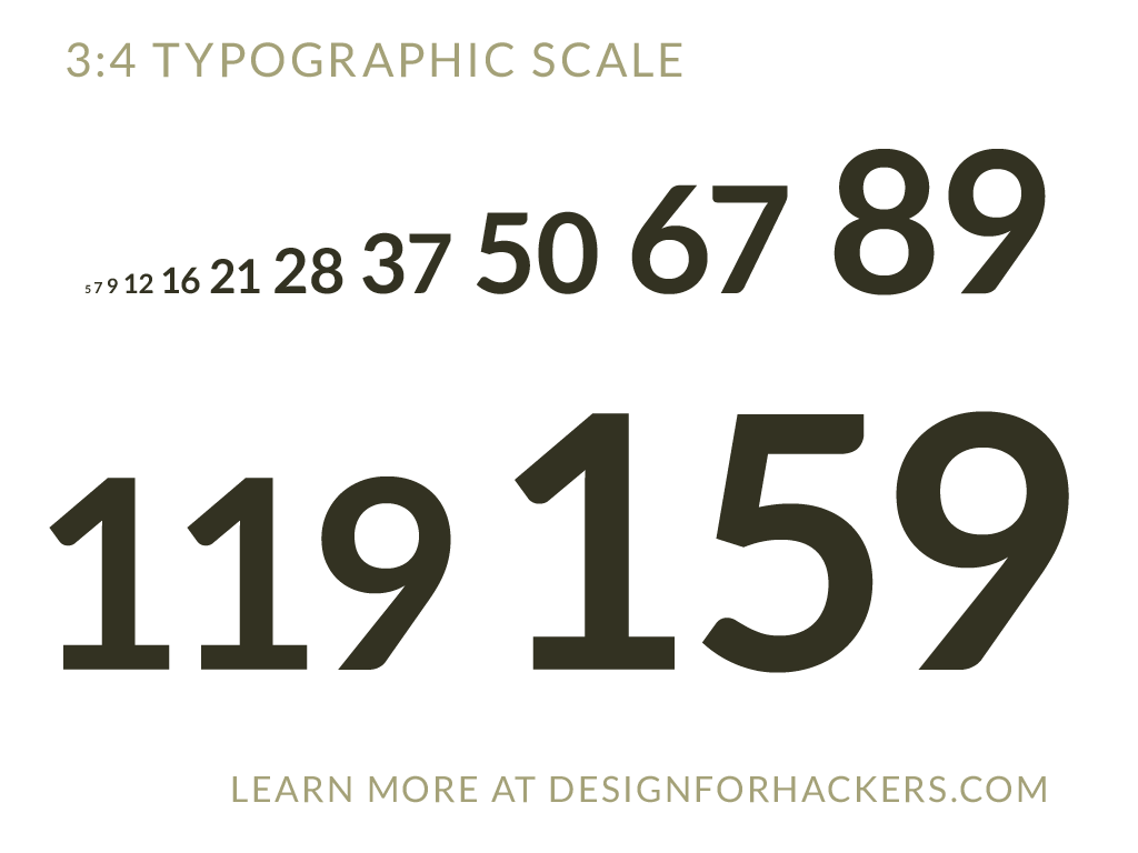
Never worry about font sizes again! (Just use these)
 One of the best ways to establish a clear visual hierarchy, and create a design that converts, is to change the sizes of the fonts you use.
Big fonts look more important, smaller fonts look less important. Simple, right?
The problem is, you waste time and mental energy worrying about what font size to use. 13px? 14px? 15px?
If you stop wasting your time and energy worrying about font sizes, you can start worrying about all of the other important aspects of a clear visual hierarchy. Best of all, you can be sure the proportions you’re using are always right on-point.
I explain more in this video:
Together, we can save humanity years of useless font size meddling. Retweet to spread the word:
Never worry about font sizes again! (Just use these) More here –> http://t.co/nRbOldHHF0 pic.twitter.com/tCAZ0a27Sl
— 📗 David Kadavy (@kadavy) August 11, 2015
