Why Monet Never Used Black, & Why You Shouldn’t Either
Monet’s paintings evoke a sense of energy and life, they leap off the canvas with color and contrast, but Monet somehow managed to avoid using the color black for nearly his entire painting career. By avoiding black in your own designs, you can replicate some of this dynamism.
Monet and Other Impressionists Explored Their Medium
Monet, and other impressionists, experimented obsessively with their medium: paint, some brushes, and a canvas. So just as pixels prohibit the use of Garamond on the web, the characteristics of the impressionists tools shaped their work. The inherent qualities of oil paint (thick and viscous), paint brushes (just a bunch of hair on a stick), and sometimes the texture of the canvas itself, lent themselves well to paintings being much more – put simply: blurry – than the more realistic paintings that were popular at the time. Photorealistic painters strived to make these qualities invisible, but the impressionists (like pixel fonts did for pixels) embraced them.
In the course of this experimentation, impressionists had to experiment with color to create the desired effects. Much like a rich-colored image is dithered when restricted to a 256 color palette, the impressionists experimented with creating the illusion of a color by placing colors next to each other which would create the illusion of the color they desired for the viewer.
The Impressionists Became Masters of Color
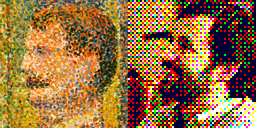
This effect was experimented with further until it became the major focus of some impressionist painters as a technique called pointillism – which involves painting dots of color next to each other to create the effect of a different overall color. Georges Seurat is credited with developing the technique, and one of his paintings close-up doesn’t look all that different from a dithered GIF image, as you can see in this example of a close-up of one of Seurat’s paintings next to a blown-up GIF image with a palette of only 8 colors and a pattern dither.
By experimenting this way, the impressionists were doing much more than simply trying to replicate reality: they were analyzing the area between the subject of a piece of art, and the eye of the viewer. They were exploring just what makes ripples on water, with light bouncing off of them, glimmer the way they do. They analyzed what collection of colors make up the shadow of an object to give it dimension, and black wasn’t one of those colors.
Color Theory Explains What the Impressionists Discovered
Why this is can be explained by color theory. You’ve probably seen a color wheel before. Here’s an extremely basic refresher:
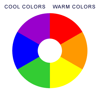
One half of the color wheel: from yellow through red, is made of what is called “warm” colors. The other half of the color wheel: from green through purple, is made up of what is called “cool” colors. Because these colors are completely saturated, I’ll go ahead and call them hues from now on. I’ll explain a little later what I mean by that.
Also, of note later on: colors that are opposite of each other are called complementary. Complementary colors contrast each other strongly, and any two complements, when mixed together as paint, result in a brownish-grey color.
Warm Colors Pop, Cool Colors Recede
As a general rule, warm hues pop out at the viewer, giving the appearance of being closer; while cool hues recede, or give the appearance of being farther away.
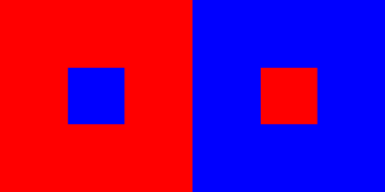
As you can see on the left side of this example, the blue block recedes, looking as if it is a hole in the center of the red block. On the right side of the example, you see the opposite effect, with the red block looking almost as if it is a tower extruding towards you from the blue block. The warm hue – red – pops out at you, and the cool hue – blue – recedes from you.
The hue is the pure base color – as taken from the color wheel. To create a more sophisticated color, a hue is tinted or shaded. A tint of a hue is basically a lighter version of that hue. If you were mixing paint, you would just be adding white. A shade is a darker version of the base hue. If you were mixing paint, you would essentially be adding black to create a darker version of the hue.
Tints Pop, Shades Recede
Its probably no surprise to you that – much like warm hues pop, and cool hues recede – tints pop, and shades recede, as you can see in the example below. With the same color of blue as the backdrop, a tinted square of that blue pops, while a shaded square recedes.

Context is Important
But will that tinted blue square always pop? Of course not: context is important, too. In this example, that exact same square is barely noticeable on a backdrop of slightly less tint, while it really pops on a heavily shaded backdrop.

Temperature is Stronger than Tint
This same phenomenon of context applies to the relative position of two hues on a color wheel as well. While neither of the middle squares of both sides of this example have any tint nor shade, their appearance relative to the blue backdrop differs drastically. The square that is purple – a color which is adjacent to blue on the color wheel – almost blends in completely, while the square that is orange, which is blue’s complement, leaps violently off of the blue field. The contrast between these two hues is so great that there is a sense of vibration where they meet. Also note that while purple is a cool hue, it is still slightly warmer than blue, which causes the purple square to pop very slightly.

The effect caused by the relative color wheel position of two hues is so strong that it nearly overpowers the effect caused by tint or shade. Even when laid over a shaded purple backdrop, the tinted blue middle square on the left side of this example recedes. Contrast that with the tinted purple square on the right side of this example, which rockets towards you off of the shaded blue backdrop.

The impressionists avoided black not only because it nearly doesn’t exist in nature, but because the effects caused by changes in hue are so much richer than those caused by changes in shade. When you use pure black to create contrast, you miss out completely on the powerful effects of changes in hue.

The left side of this example is the exact same color combination as the right side of the previous example. Notice how the dark blue backdrop recedes away from the light purple square, lifting it toward the viewer. The black backdrop certainly contrasts with the purple square, but since it has no hue relationship with the purple square, the purple square seems to just float around, while the edges between it and the black backdrop give an unpleasant effect of vibration.
Now You Know, Now What?
So, how can you use this knowledge to make your web designs better? By understanding how colors interact with one another, you can more strongly establish a heirarchy of information in your typography. Web conventions have made it widely acceptable to use black on white for text on web pages, but this is neither the most readable, nor most aesthetically pleasing option.
Enrich Your Typography
In the example below, the main text is 16px and pure black, or #000000, while the secondary text is 12px and #888888, or a neutral (neither warm nor cool) grey. You can see that there is a pretty clear heirarchy here.
© The lazy dog
This second example uses the same fonts and text sizes, but this time, a warm, dark gray is used as the base color. The main text is #503e2b, a very dark orange (a warm hue). The secondary text is a lighter version of this base color – #9e948a – found with w3school’s handy color picker. There is still enough contrast as to be readable, but the contrast isn’t as harsh as black vs. white. Overall, it’s visually pleasing, and, well – warm.
© The lazy dog
The main text in this final example uses the same dark orange from the previous example, but this time – instead of simply using a tint of this color, a complementary (cool) grey is used for the secondary text – #808094. This adds extra dimension to the hierarchy we’re establishing. The secondary text is not only smaller and tinted, but now it’s a cooler color, thus causing it to recede even more. Now there is a color relationship between the two pieces of information, which intensifies our intended hierarchy while still creating a sense of harmony and realism.
© The lazy dog
Add Life to Your Graphics
Skillful manipulation of color relationships is at the crux of creating engaging and lifelike interface graphics, such as buttons. The example below, created in Photoshop, features two buttons that are created by vector masks sharing the exact same base color (#cc6666), but the highlights and shadows are treated differently. The highlights and shadows for the button on the left are created using a “Gradient Overlay” layer effect featuring a simple black-to-white-to-black gradient, a “Linear Burn” blend mode, and a 26% opacity. The drop shadow on this button is composed of black, at a 75% opacity. This is a generally attractive button, but it doesn’t have quite the richness of the button on the right, which is created using a green-to-yellow-to-green gradient (green being cool, and the complement to red, and yellow being warmer than red), and a dark blue drop shadow – for more harmonious contrast, the text on this button is also a very light yellow. The color swatches adjacent to each button illustrate clearly how the resulting color palettes of these buttons differ.

Don’t be so quick to use black: if you really master manipulating color relationships to create dimension, you can really add freshness and life to your designs.
Why Monet Never Used Black, & Why You Shouldn’t Either http://t.co/MFSAoBhNS8
— 📗 David Kadavy (@kadavy) September 6, 2015
This post originally appeared on the author’s blog.

5 Essential Type Tips
What you must know to design like a pro.
You’ll also get bonus articles, discounts, podcast updates, & enrollment in our free design course.
We have a strict Privacy Policy.