What Font is the New Google Logo?
Google announced a new logo redesign today (September 1, 2015), citing that the platforms on which we interact with their products are now more diverse.
Today we’re introducing a new logo and identity family that reflects this reality and shows you when the Google magic is working for you, even on the tiniest screens.
Given the conflict that little pixels can sometimes have with subtle forms, like those in Garamond, this move to a sans-serif typeface makes sense for “tiny screens.”
At first glance, the logo looks to be set in Futura, a common go-to which was designed by Paul Renner in 1927.
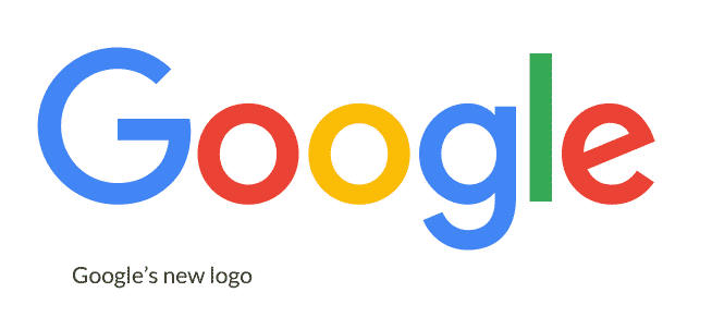
But, if you look closely, you can see that it’s NOT exactly Futura.
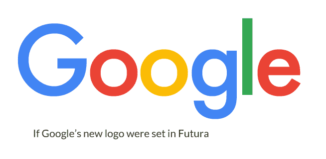
Futura is about as “Geometric” as a typeface gets. It gives it a mathematically precise look to the point that it can even be a little stale.
But, Google made some subtle but powerful changes to the typeface to suit the image they were looking for.
By examining these, you can gain an better understanding of the common logo-design practice of tweaking a typeface.
How is Google’s new logo different from Futura?
Below, you can see the subtle differences between Google’s new logo, and what that logo would look like if it were purely set in Futura. (The new logo is in bold colors, while the lighter colors are pure Futura.)
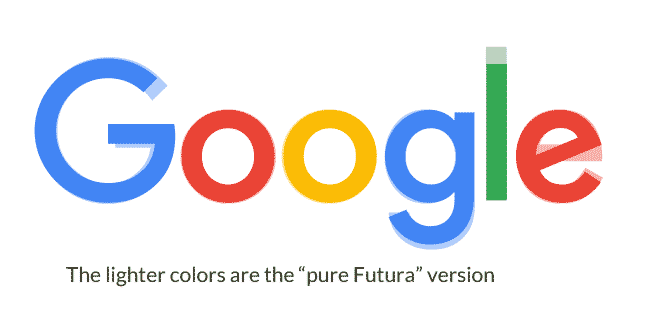
The most important tweak is to the big “G,” which is now the basis of Google’s favicon, and will appear throughout their properties.
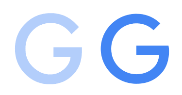
Note the following changes:
- The crossbar in the G is slightly higher, and longer. This opens the counters in the letter, which makes it feel a bit more like a “grin.” This more open counter also will be more readable at smaller sizes.
- The “aperture” of the G is more open (note the top stroke ends sooner). Again this makes the forms more friendly-looking, and makes it read better at smaller sizes.
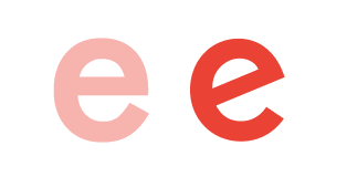
Next, the small “e” has similar changes. The crossbar is slanted up, which is typical of most “Humanist” typefaces, and is a throwback to hand-scribed letterforms that predate printing.
You’ll notice that the “e” also has a larger aperture. If you imagined them as faces, Futura would have a devious grin, while Google’s “e” is laughing hysterically.
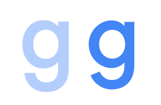
Finally, the lowercase “g” doesn’t descend as far below the baseline. This is probably to balance out the logo (you have that luxury when you know what word you’re typesetting), but also notice that terminal of the stroke in the descender slants out a bit. This, once again, makes it more readable at smaller size, while carrying the more “friendly” theme.
The final difference you’ll notice is that the “l” is slightly shorter. This is, once again, likely a balance issue.
Google’s New Logo is Based Upon Their Custom Font, Product Sans
Many people are wondering “what font is the new Google logo?”
To be perfectly accurate, Google’s new logo isn’t in any one particular font. It’s a logo, and usually logos (at least for a big company like Google) have some customizations to them. This is one of those rare cases where you know exactly what letters will be displayed, so the designer can balance the letters how they see fit.
So, no, there is no one “Google logo font.” But, Google’s new logo is based on their new font, “Product Sans.”
In case you’re wondering, no, you can’t use Product Sans yourself. As this thread points out, the license for Product Sans states:
Google offers many fonts on open source terms. This is not one of them. Please see www.google.com/fonts.
Fair enough. Google has made many fonts available, so they’re entitled to their own.
Product Sans is clearly heavily influenced by Futura, which was designed by Paul Renner in 1927.
The biggest difference you’ll see between Futura and Product Sans is the double-story “a,” which is a common feature of more Humanist typefaces. This choice was made to avoid “redundancy in product lockups,” which I assume means “too many damn circles.”
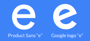
There is no “a” in “Google,” however, there is one glaring difference between Product Sans and Google’s logo: it’s that slanted “e” again.
What Other Fonts Look Like Google’s Logo?
There’s hardly such thing as a totally original font, so naturally, there are other fonts that resemble the Google logo. Here’s a comparison:
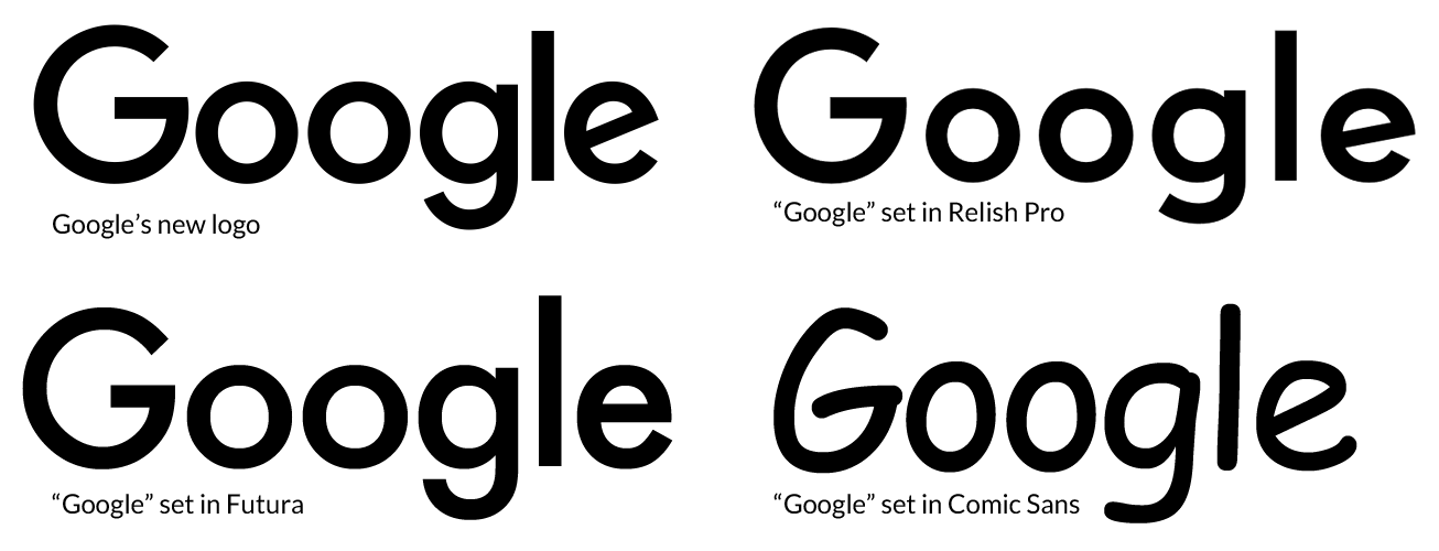
Aside from Futura, Google’s logo resembles Relish Pro, (although, Relish Pro has a notably smaller x-height).
Some have also said that Google’s new logos resembles the hated Comic Sans. But, I disagree.
Windlesham Pro is also a close cousin, minus that funky descender on the lowercase “f.”
Want to learn more about picking fonts? Take my free design course.
What Font is the New Google Logo? http://t.co/e9aOc1dPSW pic.twitter.com/wg9DCNDwUK
— 📗 David Kadavy (@kadavy) September 5, 2015
