Why You Hate Comic Sans
Everyone loves to hate Comic Sans. The child-like handwriting font is so infamous, there is a movement to try to ban it. Mention its name to the common layman (aside from a preschool teacher), and you will likely get a chuckle, mention it to a trained designer, and you’ll get a look of disgust. In my free design course, I teach you how to battle font anxiety, but I can tell you right now Comic Sans is usually not a good choice. What exactly makes Comic Sans so horrible?
I recently gave a talk at IgniteChicago – with less detail than what follows – about just why it is that Comic Sans is so hated:
Comic Sans vs. Helvetica
To illustrate the poor fundamentals of Comic Sans, I will compare it to Helvetica, which is such a beloved font, that there’s a movie – about typography – named Helvetica.
First of all, I should acknowledge that comparing these fonts is a bit apples to oranges (which are both fruits, mind you), in that they both convey completely different moods: Helvetica looks strong and serious, and Comic Sans is usually used in situations where one wants to look playful and casual.
Both Have Unmodulated Strokes
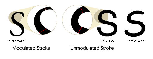
But they have their similarities as well. They both have a relatively unmodulated stroke, meaning that the thickness of the strokes on the fonts don’t change throughout the stroke. This sample shows how Helvetica’s form differs from that of Garamond, which has a modulated stroke. Comic Sans also has an unmodulated stroke.

This modulation is a result of Garamond’s form being derived from that of scribed letters. Before printing was available in the West, scribes lettered Bibles beautifully and patiently by hand, using a flat-tipped pen, held at a fixed angle, which influenced the form of those letters – resulting in a modulated stroke. As printing was developed, the letters created mimicked scribed letters, and – while they eventually developed their own forms – printed letterforms almost exclusively had modulated strokes until sans-serif type was popularized in the early 1800’s. The forms of most sans-serif fonts are not influenced by drawing tools.
Helvetica Manages Weight Better
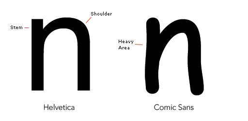
Though the strokes of Helvetica’s letterforms are unmodulated, some adjustments are made to improve its legibility. For example, notice how the stroke on Helvetica gets thinner where the shoulder meets the stem on this letter n. This helps to give the letter a more even visual weight. Notice how Comic Sans is not this way. If you squint your eyes, you’ll notice that there is a disproportionately heavy area where these strokes meet on Comic Sans, while Helvetica’s weight is more evenly distributed. The ironic thing about this distinction is that Comic Sans is actually influenced from a drawing tool: a round, felt-tipped pen or marker; but, the stroke of this tool is unmodulated. Meanwhile, the letterforms of Helvetica are rationalized from predecessors, without apparent influence of a drawing tool.
This mismanagement of visual weight is the main issue that makes reading Comic Sans an unpleasant experience. Evenness of weight, or “texture” is important to the legibility and readability of typography. Letters or blocks of text that are free from disproportionately light or heavy spots allow the letterforms themselves to shine through and be read easily.
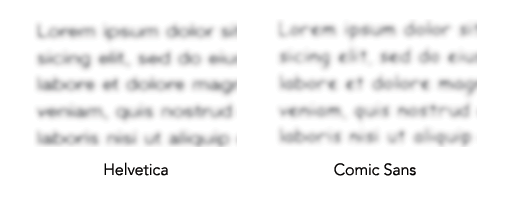
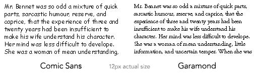
This example shows how a block of text set in Helvetica differs in texture from a block of text set in Comic Sans. I’ve blurred both blocks of text and bumped up the contrast so we can all collectively experience an objective form of squinting – to identify areas that are excessively light or dark.
First, notice the general variation of lightness and darkness in the lines of type. The Helvetica is a more uniform grey, while the Comic Sans varies widely, with some very dark spots scattered throughout the body of text. The most obvious anomolies are the letters “e” and “t,” the former of which appears like a blood stain a number of times in the example, and the latter which sticks out like a dead tree.
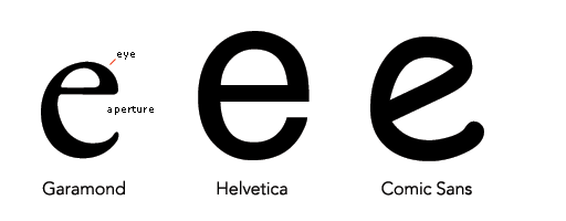
The Comic Sans “e” appears more dark than the other letters because its overall visual weight is mismanaged. When compared to Garamond and Helvetica, we can get some idea of why. Garamond’s “e” features a very large aperture, and small eye, but its stroke modulation keeps it balanced. The extreme heaviness of the stroke towards the bottom left of the “e” is balanced out by the large aperture, and the tiny eye is balanced out by the very thin bar that closes out the eye. Helvetica maintains balance by compensating for its absence of stroke modulation by having a larger eye and a smaller aperture. Comic Sans, however, by virtue of its handwriting-based style, has a tilted – incidentally “Venetian” – eye to its “e” giving it both a small eye, and a large aperture. Since there is no stroke modulation to Comic Sans, it can’t compensate for this lack of balance and thus utterly fails.
Comic Sans Has Poor Letterfit
But poor management of visual weight within the letterforms themselves isn’t the only characteristic that makes Comic Sans uneven in body text. The “letterfit” – or consideration given to the letterforms to allow them to be set together in an even manner – of Comic Sans is very poor. The letterfit of Helvetica allows for it to inherently have decent kerning tables. Kerning is the distance between two letters, and good fonts have parameters set for just about every letter combination (or “kerning tables”) in which the font may eventually be set; but if the letters themselves aren’t designed with consideration given to how the letters will relate to one another, then producing good kerning tables is impossible.
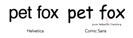
You can see that Comic Sans has an awkward gap between the “f” and the “o,” but this pairing can’t simply be more tightly kerned, as it would create an area of tension – from too close proximity – between the crossbar of the “f” and the “o.” You can see similar problems throughout the font, but this is one of the better examples. This problem could have been avoided if the leading portion of the crossbar of the “f” weren’t so long (notice that it is shorter on Helvetica). One way to compensate for these poor pairings would be to space the letters out a bit on the whole, to allow for relatively tighter pairings for problem areas such as I’ve described; but, this isn’t feasible in most computer applications, and it would do little to make up for the other blunders of Comic Sans.
So, the typographic fundamentals of Comic Sans are very poor as used in high-resolution situations, but Comic Sans was never intended to be used in this manner, and that is part of why its considered such a bad font.
Comic Sans isn’t Used as Intended
Comic Sans was originally designed to be used in the talk bubbles of a program called Microsoft Bob. The font wasn’t completed in time to actually make it into the program, but it lived on to eventually ship with Windows 95; and that’s when the font really got ugly.
Once the font was in the hands of Windows 95 users, there was no telling how people would use it. Now, it was going to be printed out on bake sale flyers, birthday party invitations, and even business cards. But remember, this font was designed to be used on-screen, and in 1994, when the font was designed, most computers for personal use – and Windows 95 – didn’t have anti-aliasing.
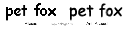
Anti-aliasing is the technology that makes fonts looks smooth on-screen. Without ant-aliasing, fonts look jagged – as if they were made of LEGOS®. This isn’t the end of the world, as long as the font is designed accordingly. Notice how much better the “e” of Comic Sans distributes its visual weight when aliased.
In fact, when compared to Garamond, which wasn’t originally designed for the screen, Comic Sans fares quite well in terms of readability.
Where the Hate Comes From: The Wrong Place at the Wrong Time
So, the story of Comic Sans is not that of a really terrible font, but rather of a mediocre font, used incorrectly on a massive scale. Windows 95 was the first operating system to really hit it big. Just as computers were starting to pop up in nearly every home in America, Windows 95 was finding itself installed on all of those computers, and with it, the font Comic Sans. So now, nearly every man, woman, child, and bake sale organizer find themselves armed with publishing power unlike civilization had ever seen; and few of them really had any design sense.
Comic Sans Rode a Wave: Desktop Publishing
It used to be that if you lost your kitten, and wanted to make a poster, probably the most efficient way to make a flyer would be to draw one up with magic marker, cut out a picture of the cat, and go down to the nearest supermarket to make copies of it at 15 cents apiece. Then, you would post them up in your neighborhood; and – like a caveman – you would pick up a phone, call the newspaper, and place an ad to help find your kitten.
But now that you had Windows 95, a personal computer, and a printer, you could use Word to make your lost kitten poster, and print it out at home. And, wow! You could use any font you wanted. What’s that? You don’t know anything about fonts? Of course not, because you’ve never had this power before. So, guess what font makes you think about your lost kitten?
This is a monumental moment in history – right up there with the invention of printing – for common people to suddenly have the power to typeset and print documents. No big deal for awhile: some people got to enjoy making their own Christmas cards, birthday party invitations, etc. for awhile, and the small audiences of their families and coworkers suddenly had to put up with some ugly, clip art riddled Christmas cards.
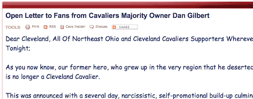
But then, gradually, over the next 10 years or so, the internet got more and more popular. Now, that publishing power got even stronger: instead of flyers posted in break rooms, Comic Sans was showing up on websites, and even as the default font for many people’s emails. Now, any one person could write a message that could potentially be read by millions, in Comic Sans. This actually happened when Cleveland Caveliers owner, Dan Gilbert wrote a letter regarding the dramatic departure of LeBron James, in Comic Sans – resulting in a media storm over the poor font choice.
The Rise of the Graphic Design Degree, & The Formation of an Army of Haters
But where did all of this hatred come from? Well, while grandmas around the world were printing birthday invitations in Comic Sans, the field of Commercial Art (now known as “Graphic Design”) was enjoying the revolutionary typesetting power that the Macintosh provided. No longer did they have to blindly “spec” out type, not knowing what the final result would look like until their work got back from the typesetter. This made the production of high quality print design much cheaper, and much more viable for businesses to spend money on. So, with the increased demand for Graphic Design services, Design schools started churning out graduates at an unprecedented pace. Who doesn’t want to just sit and draw stuff for a living, right?
At this point – the late 90’s – all of these young people are suddenly seeing the world through new eyes. Having been through it myself, words cannot describe the jarring experience of Pandora’s box being opened up to reveal that 95% of every designed thing you see is ugly. Terrible font choices, poor kerning, haphazard color choices, and stupid concepts suddenly assault your eyes once you learn about design principles, color theory, typography, and concept development. A large portion of conversations between myself and other self-righteous design students were – and still are – about how terribly designed everything is: campus wayfinding signage, the t-shirt for the latest toga party, and yes, lost kitten posters.
But most of these design students were – and still are – blind to what a monumental, mammoth, incredible, revolutionary, huge thing was occurring. Their grandmother could typeset and print out as many lost kitten posters as she wanted. She can even make a website about her kitten, and someone in Tanzania can read about it (this is probably only remarkable to you if you don’t live in Tanzania). This makes Gutenberg’s 42-line Bible look like the non-self-inflating Whoopie cushion!
The Clash of Knowledge & Ignorance
Eventually, regular people got more familiar with this publishing power, desktop publishing applications – like Microsoft Publisher – became more widely available, and more people started to get the hang of publishing on their own. This really started to encroach on the territory of these fresh design graduates, many of whom were finding being a Graphic Designer to really suck: a client may have her nephew design a brochure, and hire you to clean it up, or worse yet – take a stab at it herself.
Meanwhile – this is the last decade or so – the same invention that made Graphic Design easier was making it way harder: print was dying, and the web was growing. Now, clients are trying to direct designers themselves, and the designers need to learn how to code web pages just to stay relevant. This doesn’t sit well with most designers.
So, you see, Comic Sans is an archetypal enemy of the Graphic Designer. Its not only an unattractive font, but it also represents the invisible, evil force that is making the “print” designer less and less relevant. A natural reaction to being threatened is violence, and the hatred for Comic Sans is arguably violent.
A Well-Designed Future
Comic Sans is at the disposal of nearly everyone with a computer; but that doesn’t mean that we will always have to be subject to its awkward forms. The spread of Comic Sans – a pretty bad font – is the result of the spread of an inarguably good technology. Just as the advent of movable type eventually led to a spread of literacy, the advent of personal publishing should lead to the spread of design literacy; and with it, a populace too informed to stoop to using Comic Sans.
Want to learn more about choosing the right font? Sign up for my free design course.